Material Bank is the leading marketplace for architectural and design materials. Despite its scale, many of its powerful tools remain underused because they aren’t connected within a cohesive workflow. This project repositions Material Bank as the daily workspace for design teams—unifying tools, projects, and communication into one clear hub.
We began by interviewing designers about their fabric sourcing process and workflow pain points. Through this, we uncovered that Material Bank’s strongest tools often caused confusion instead of clarity.
The interviews aimed to understand how people source fabric for upholstery projects. By keeping the conversations open-ended, I uncovered key limitations with Material Bank, the primary marketplace for design professionals.
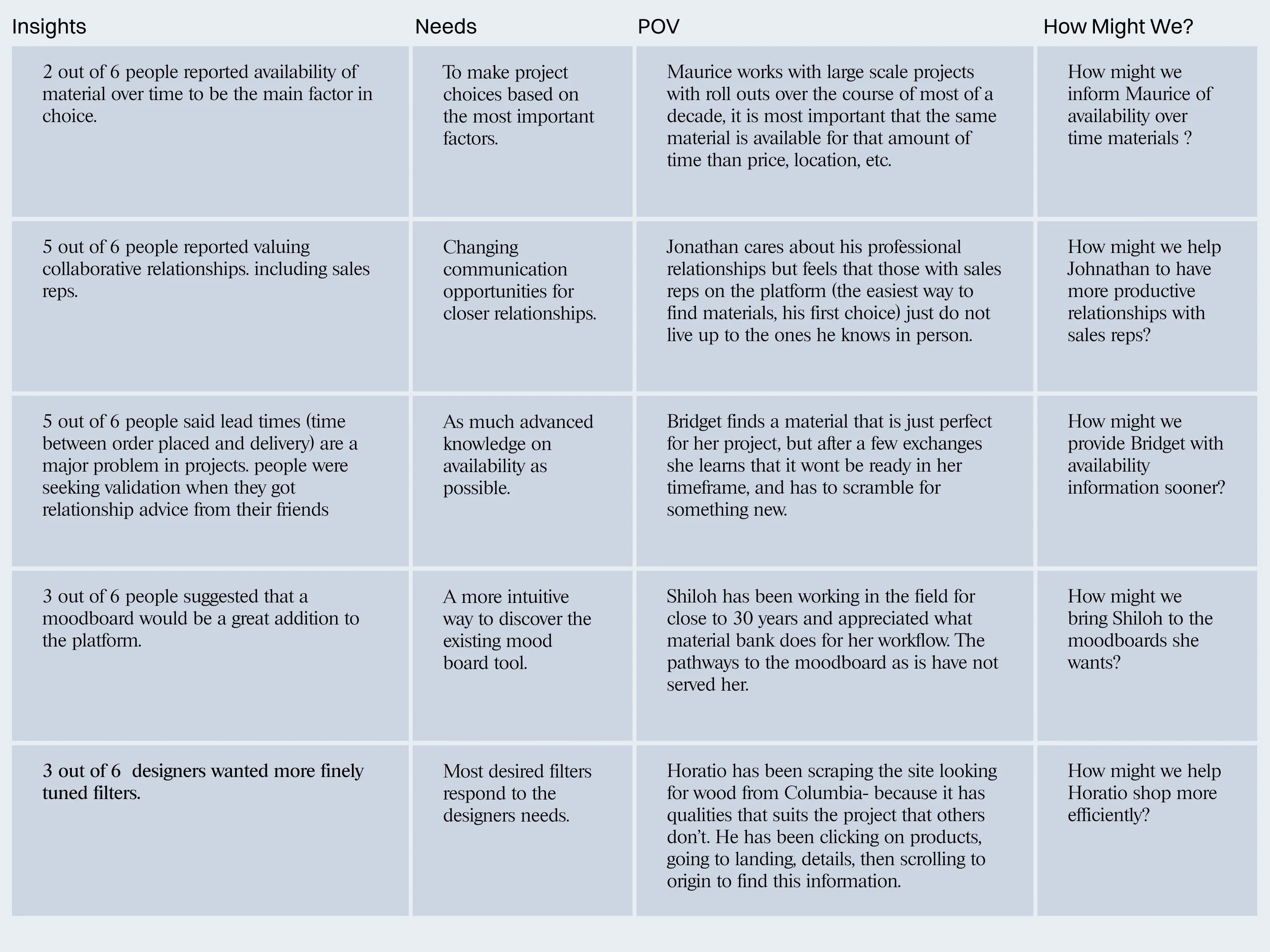
Designers agreed that lead time is the most crucial detail in selecting a material.
People reported availability of material over time to be the main factor in choice.
This was particularly important in projects with multiple locations built over a wide span of years.
People suggested that a moodboard would be a great addition to the platform.
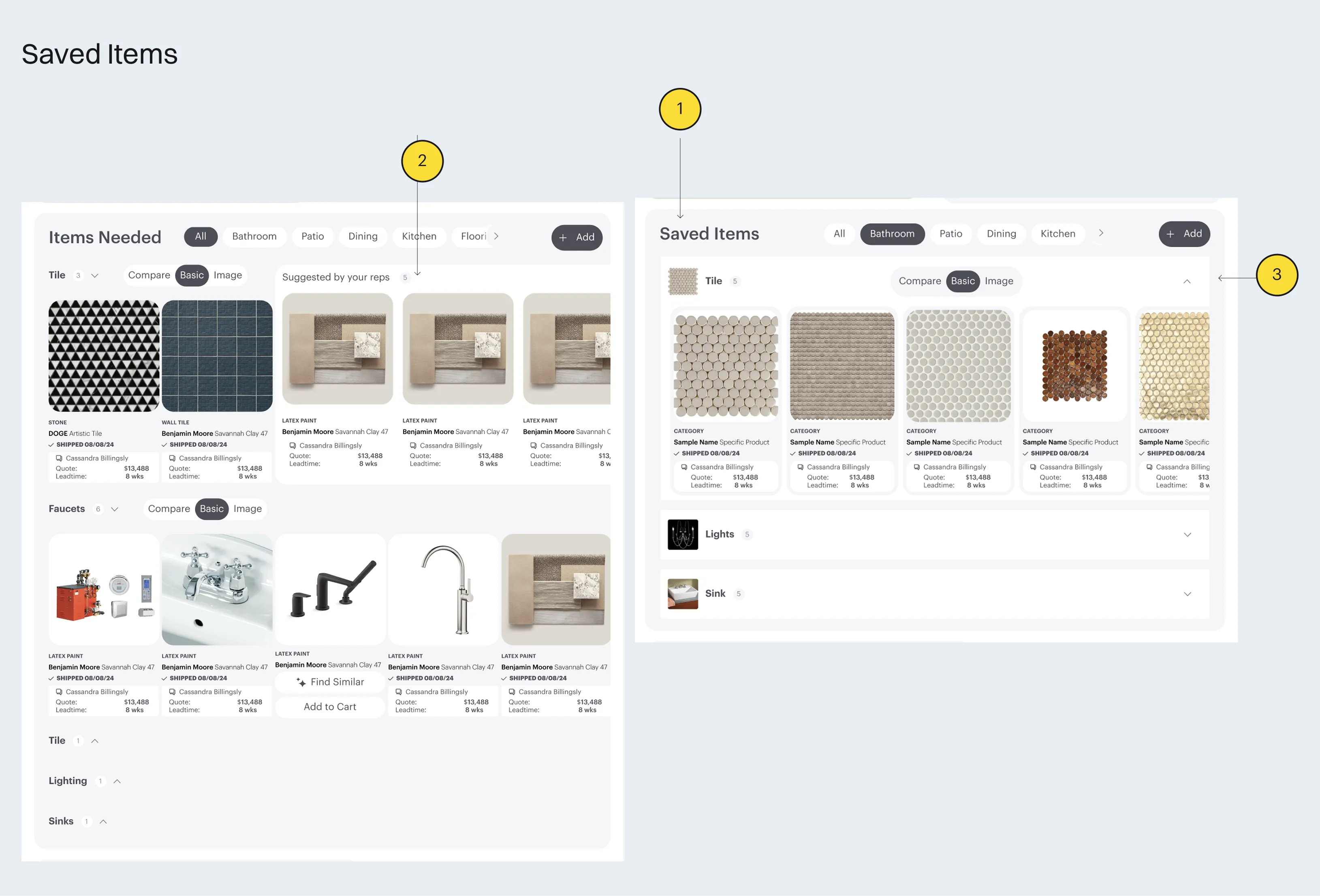
Material Bank already has a robust and feature-rich moodboard. The lack of awareness of this feature is the first signal of the most important issue.
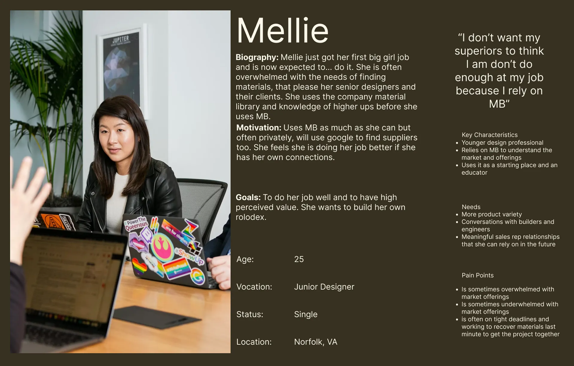
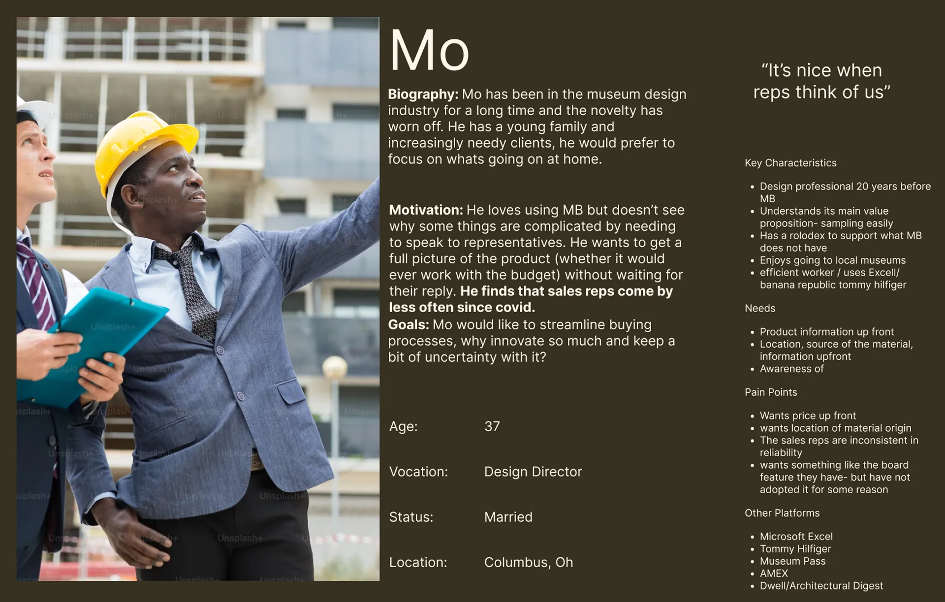
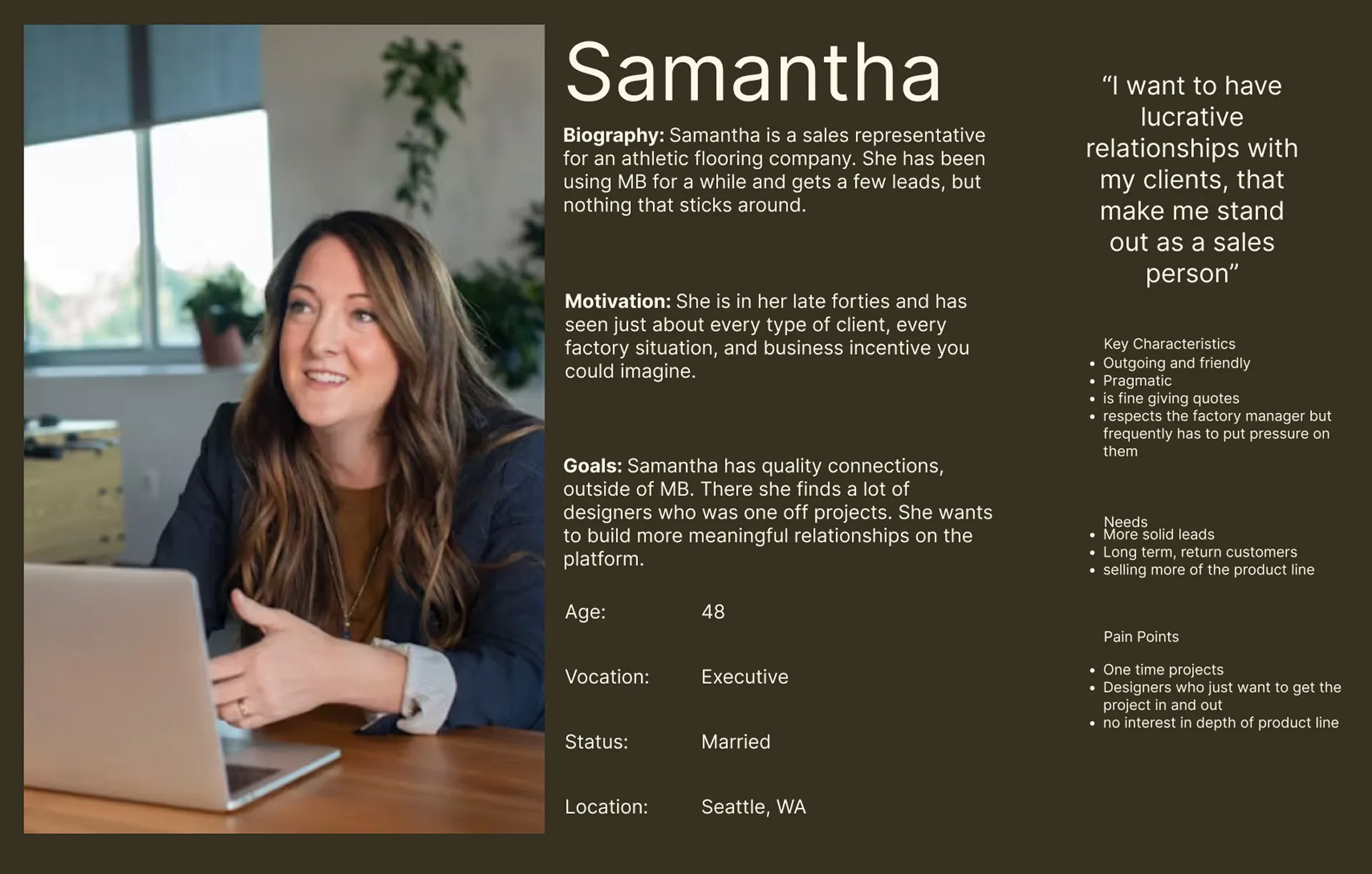
Valued the collaborative relationships they had: including with sales reps. Experienced designers missed the personal connections and energy of physical Material Libraries, while younger designers felt a loss of networking opportunities.
participants wanted Material Bank to offer a mood board tool they have one already
"I wish there was ... a more visual interface. That would help me see everything in context."
designers appreciate the value of a collaborative team environment.
This includes sales representatives and their team.
Material Bank values sales representatives on their site, but even so the nature of the relationships has changed.
Articulating insights into human needs revealed the underlying motivations shaping how designers source and collaborate
The synthesis resulted in personas of designers and reps in different parts of their careers. They are divided by the amount of time they have spent in the field and the way that filters their relationship with reps, resourcing, and collaborating.
Looking at users needs generated many paths forward that were narrowed down with a combined MoSCoW and RICE ranking system and are summarized below.
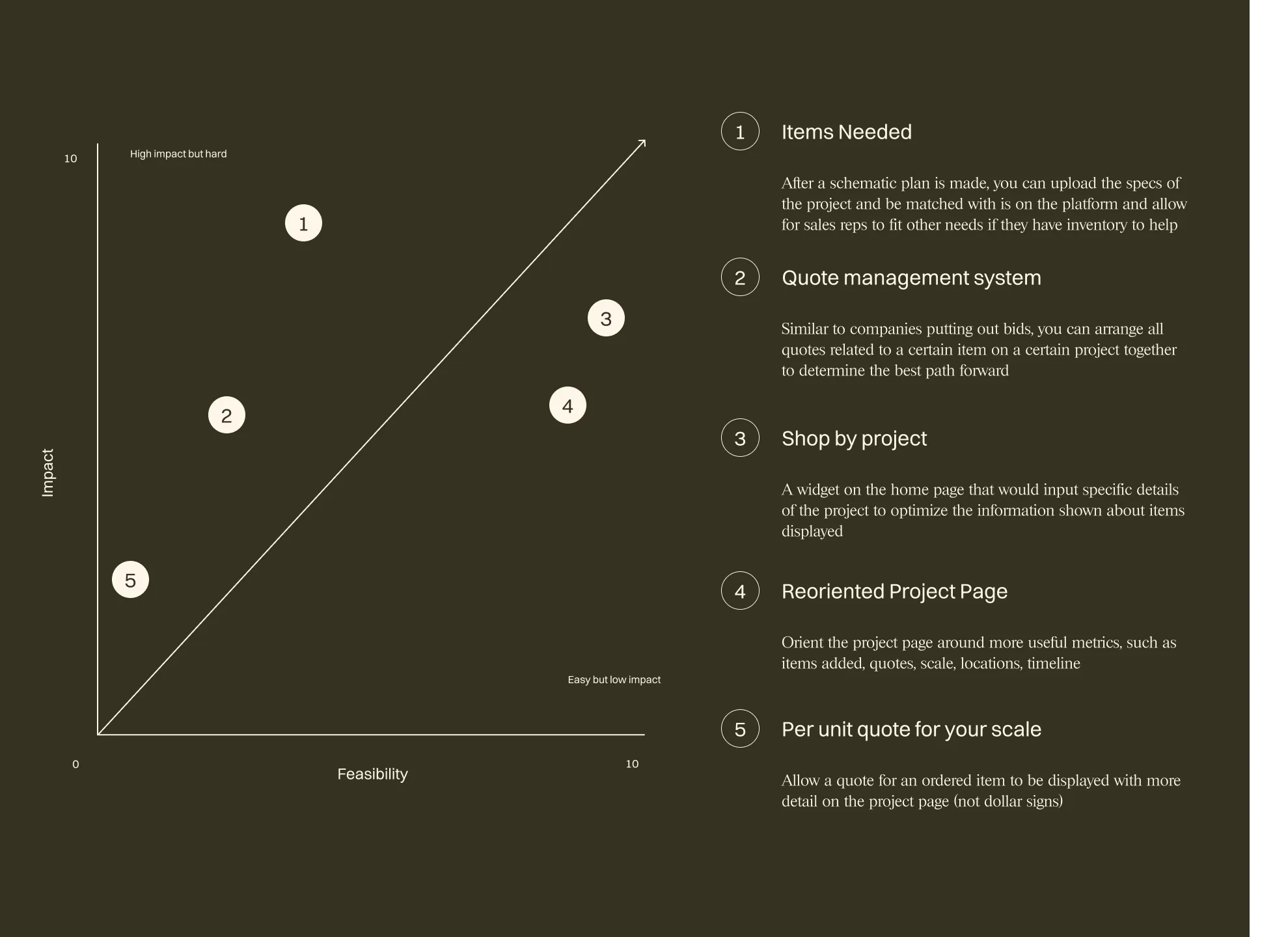
The chosen and eliminated features resulted in new content arrangement for the site to increase accuracy and satisfaction.
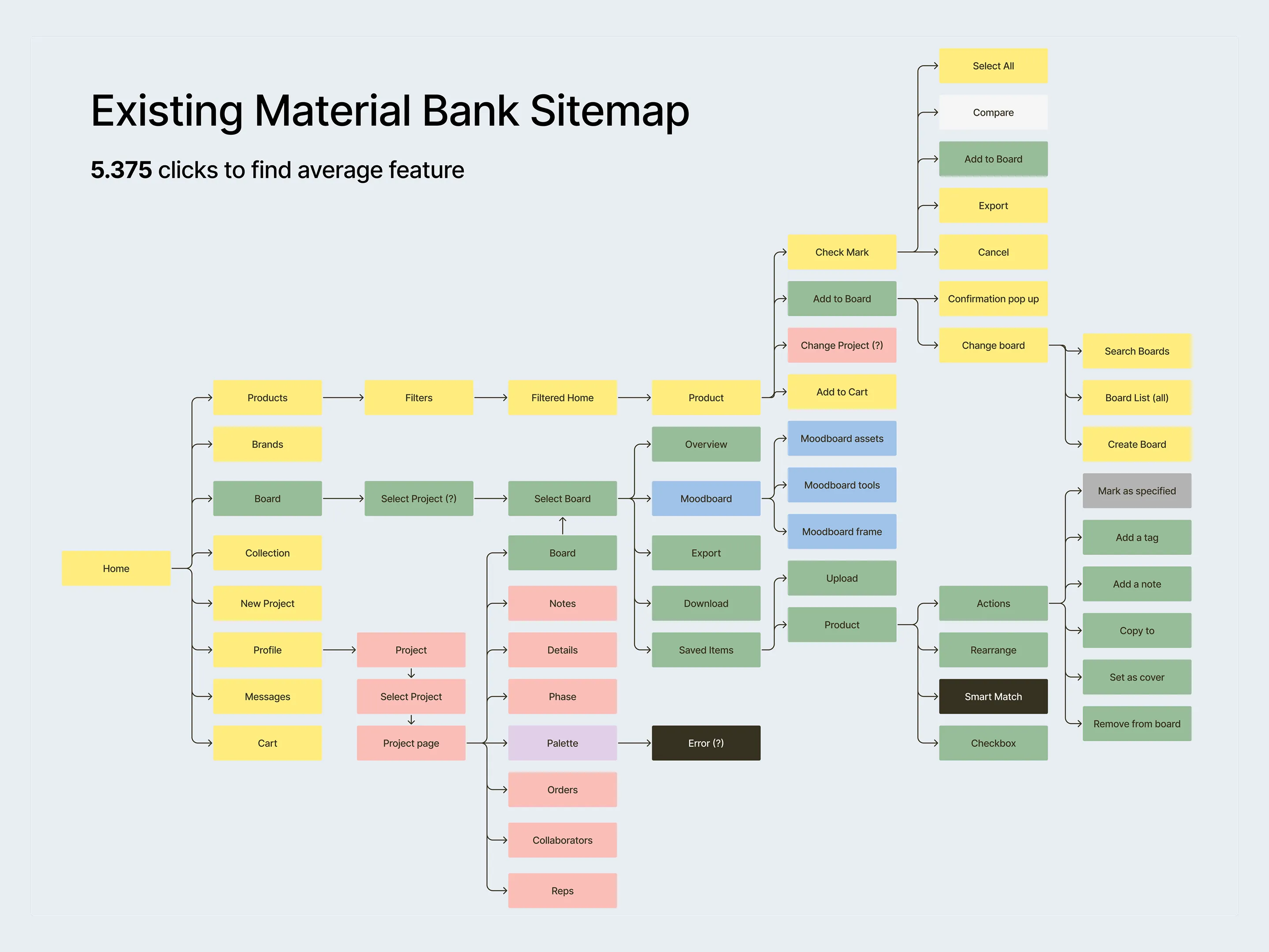
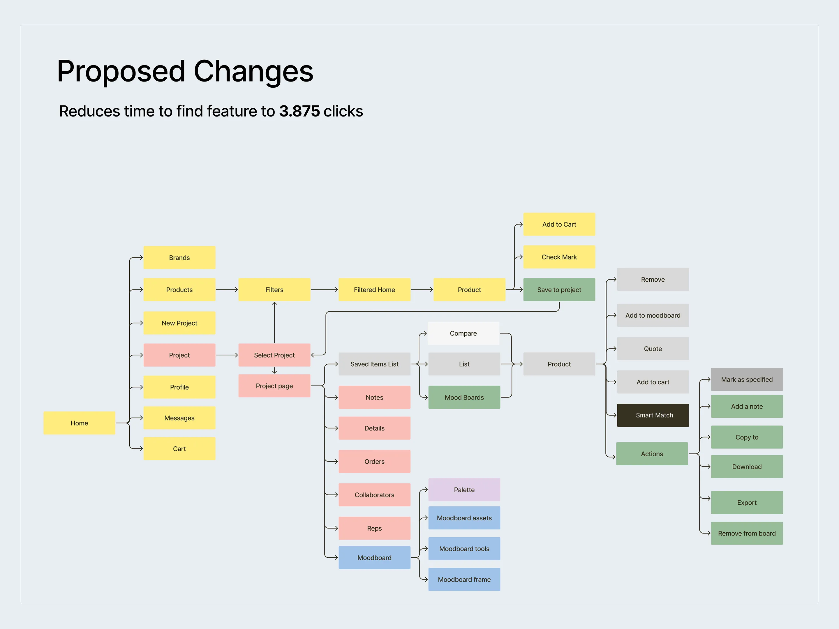
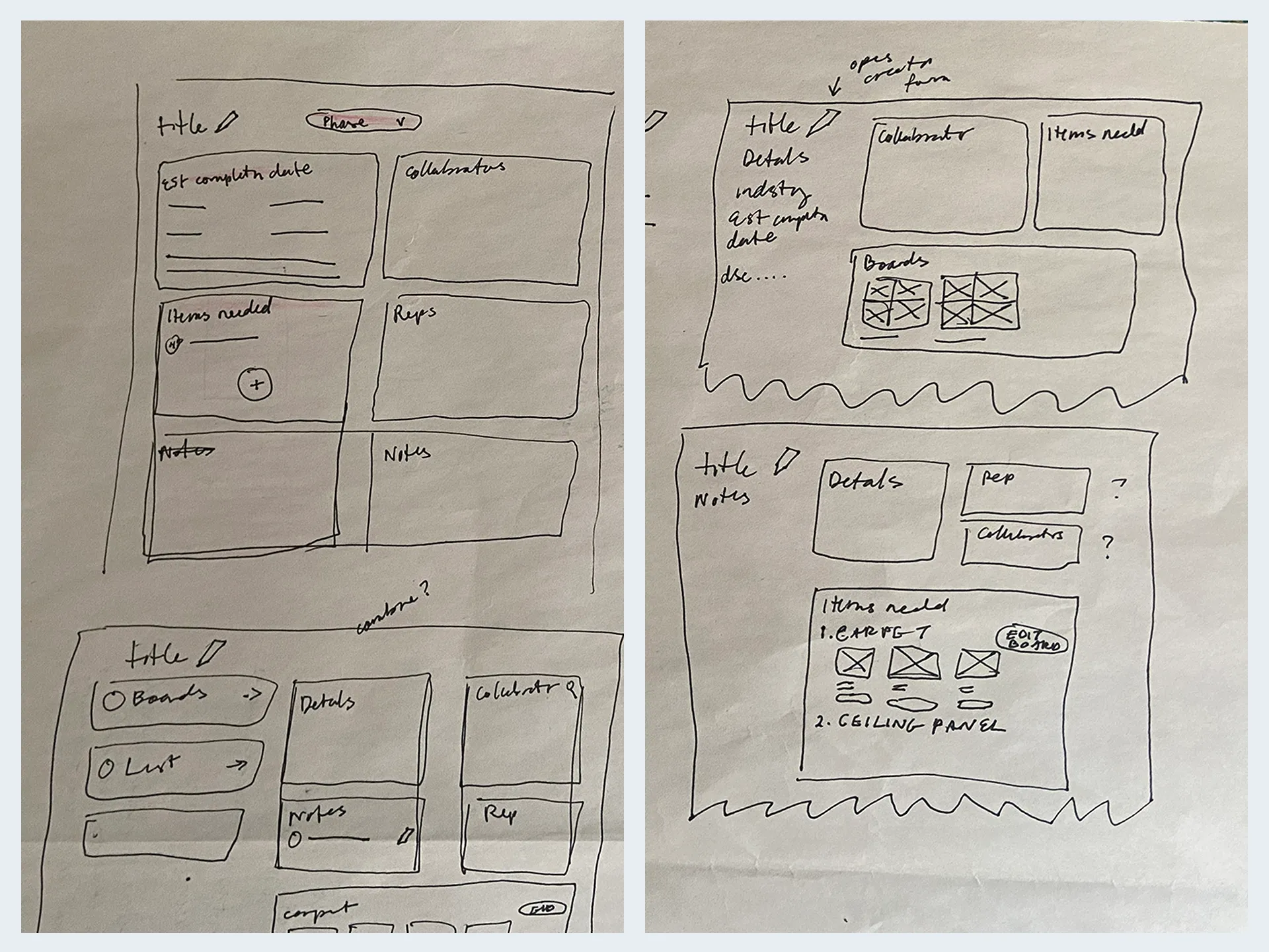
This section will go through the initial changes implemented by feature on their key pages. Without futher ado:
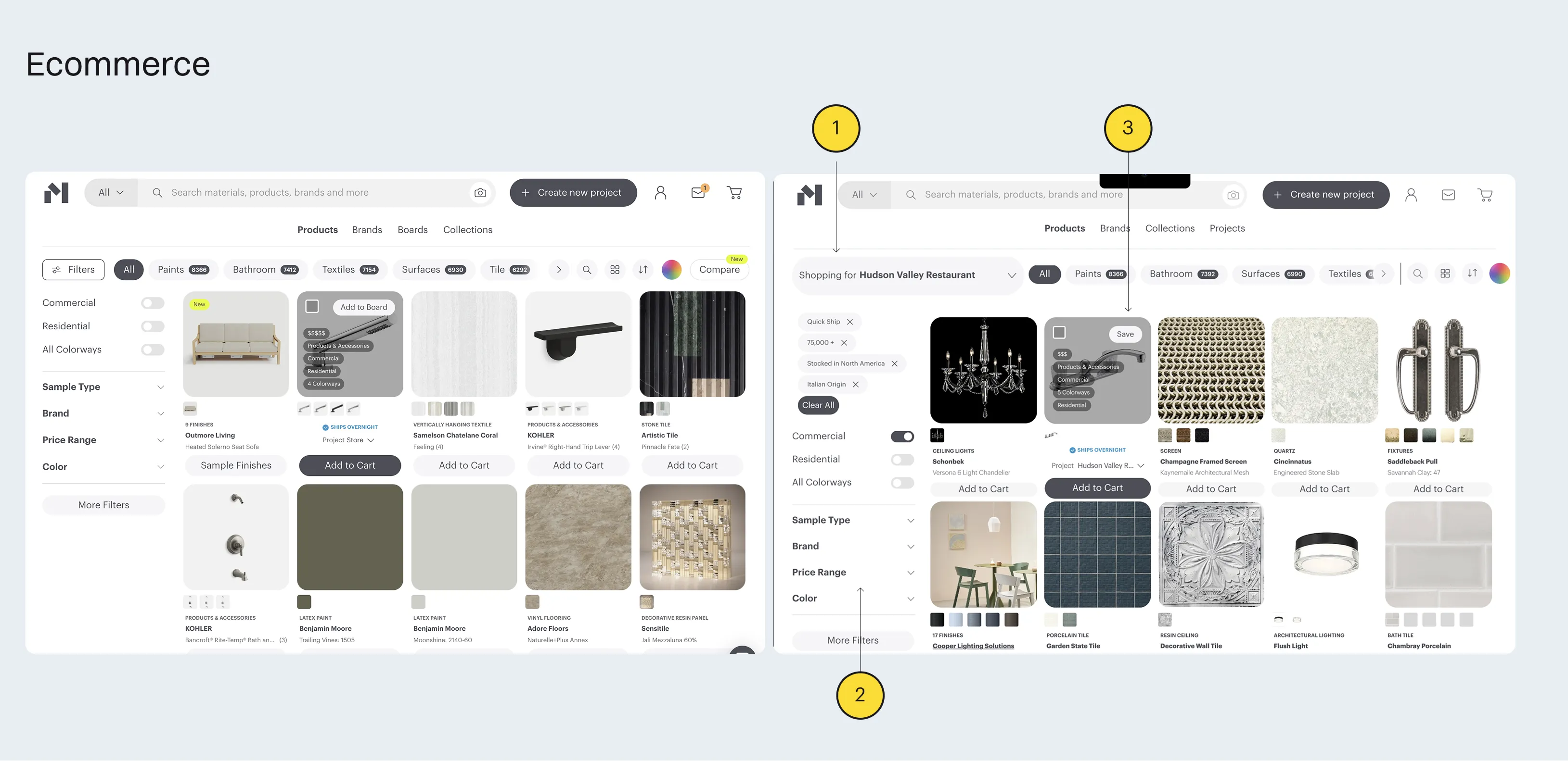
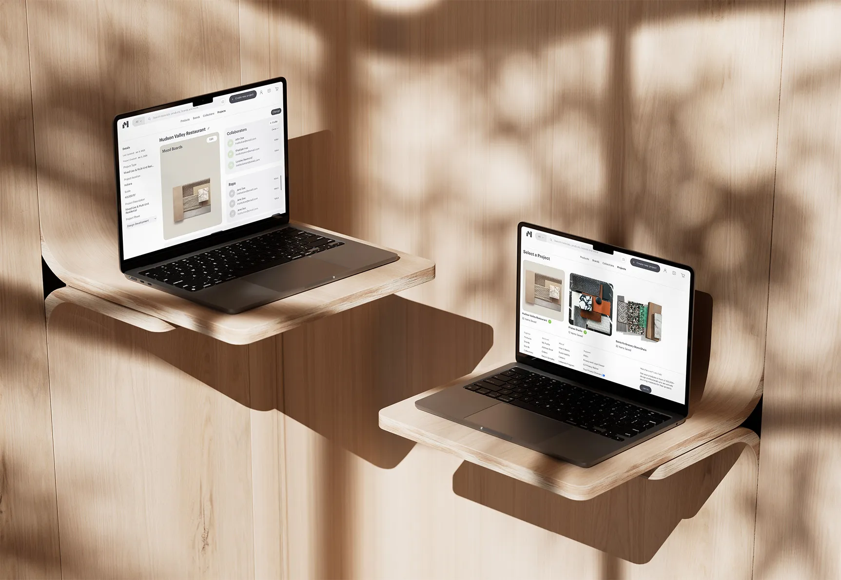
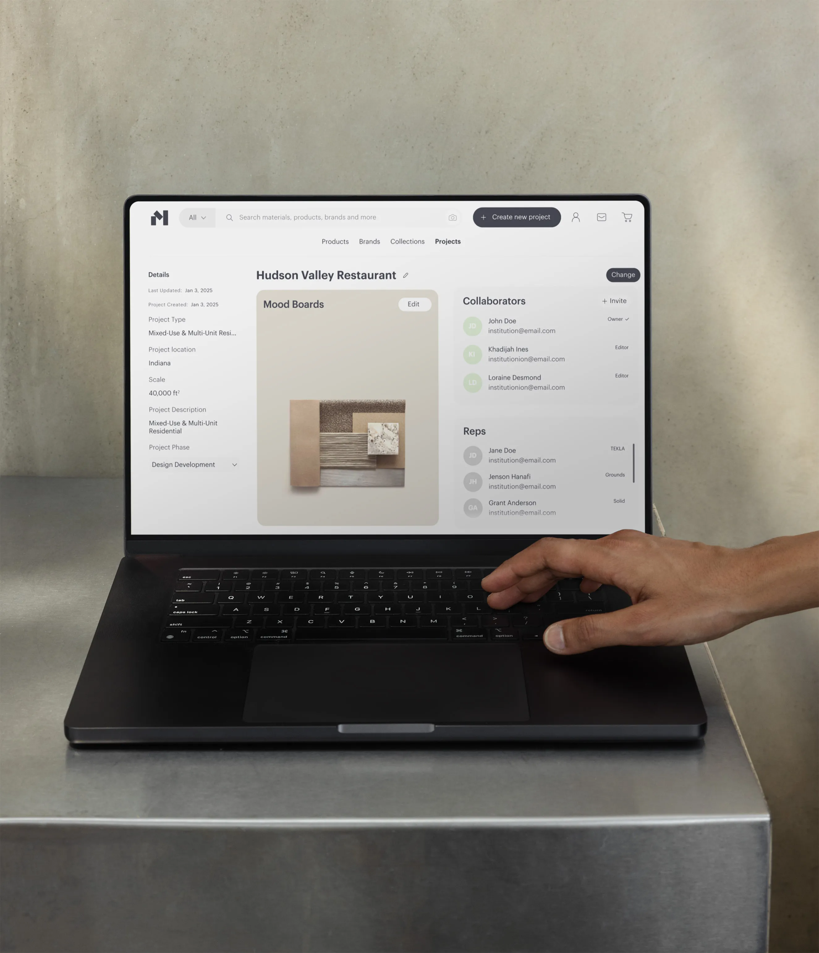
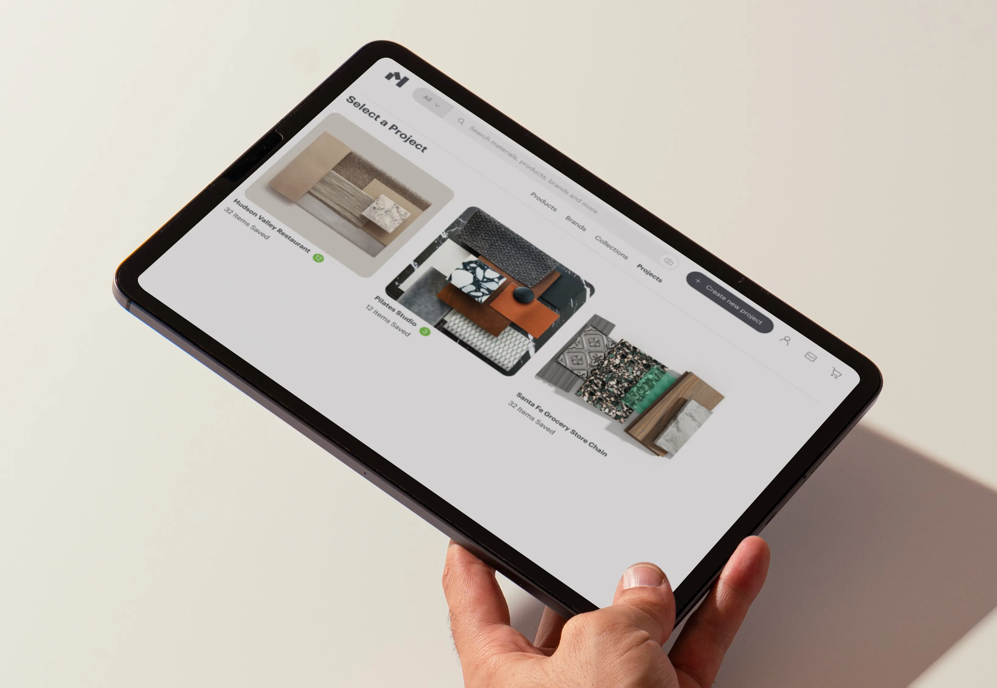
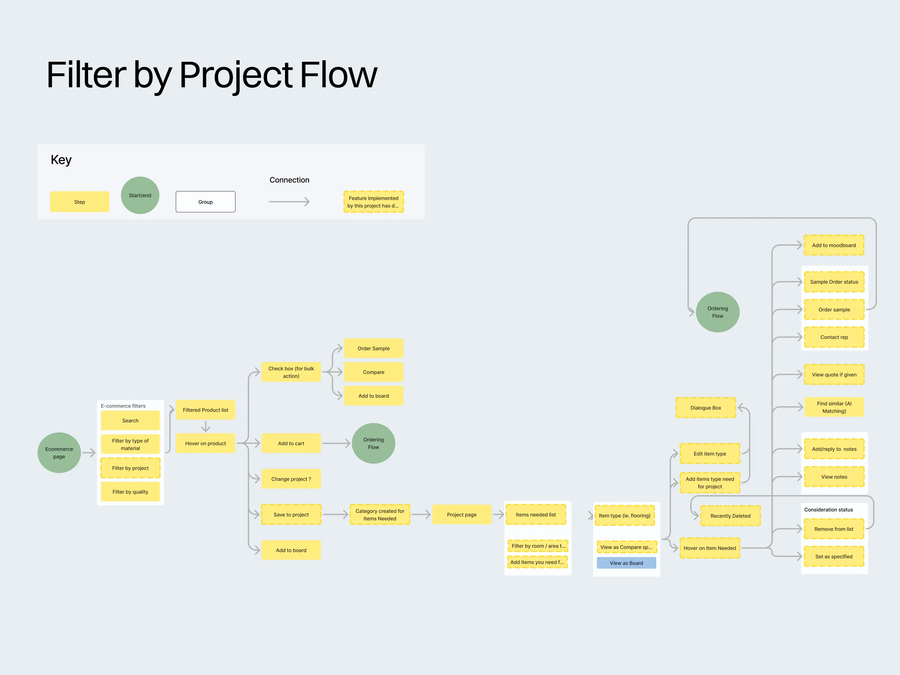
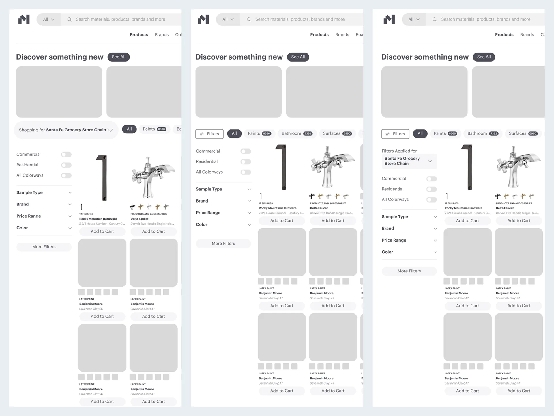
The first implementation is a large widget that allows you to change the project you are shopping for.
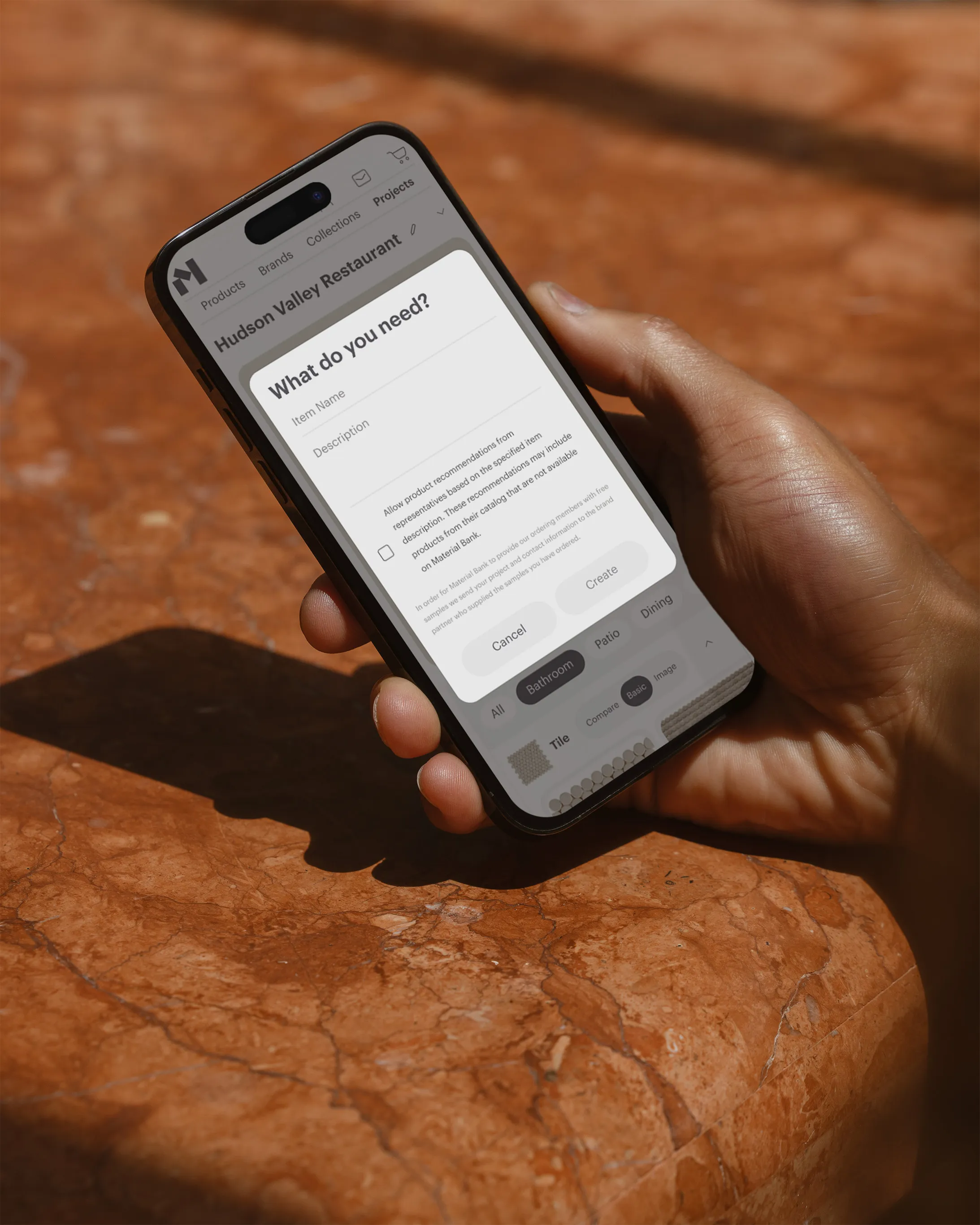
The filters that correspond with the answers from the "Create a Project" form.
The hover state uses a clearer, more actionable, "Save" button text while retaining the overall composition.
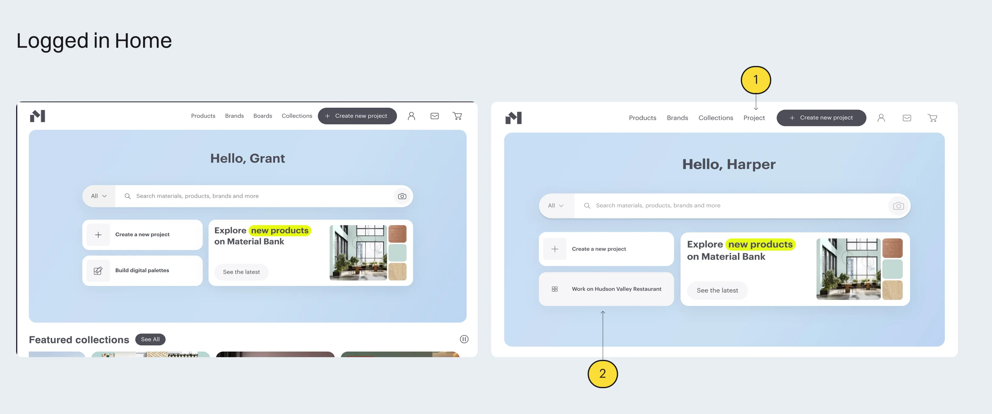
Project replaces Boards in the primary navigation to reduce the amount of clicks necessary to reach the most powerful tools.
A widget to go to your current project was added.
The first implementation is a large widget that allows you to change the project you are shopping for.
The filters that correspond with the answers from the "Create a Project" form.
The hover state uses a clearer, more actionable, "Save" button text while retaining the overall composition.
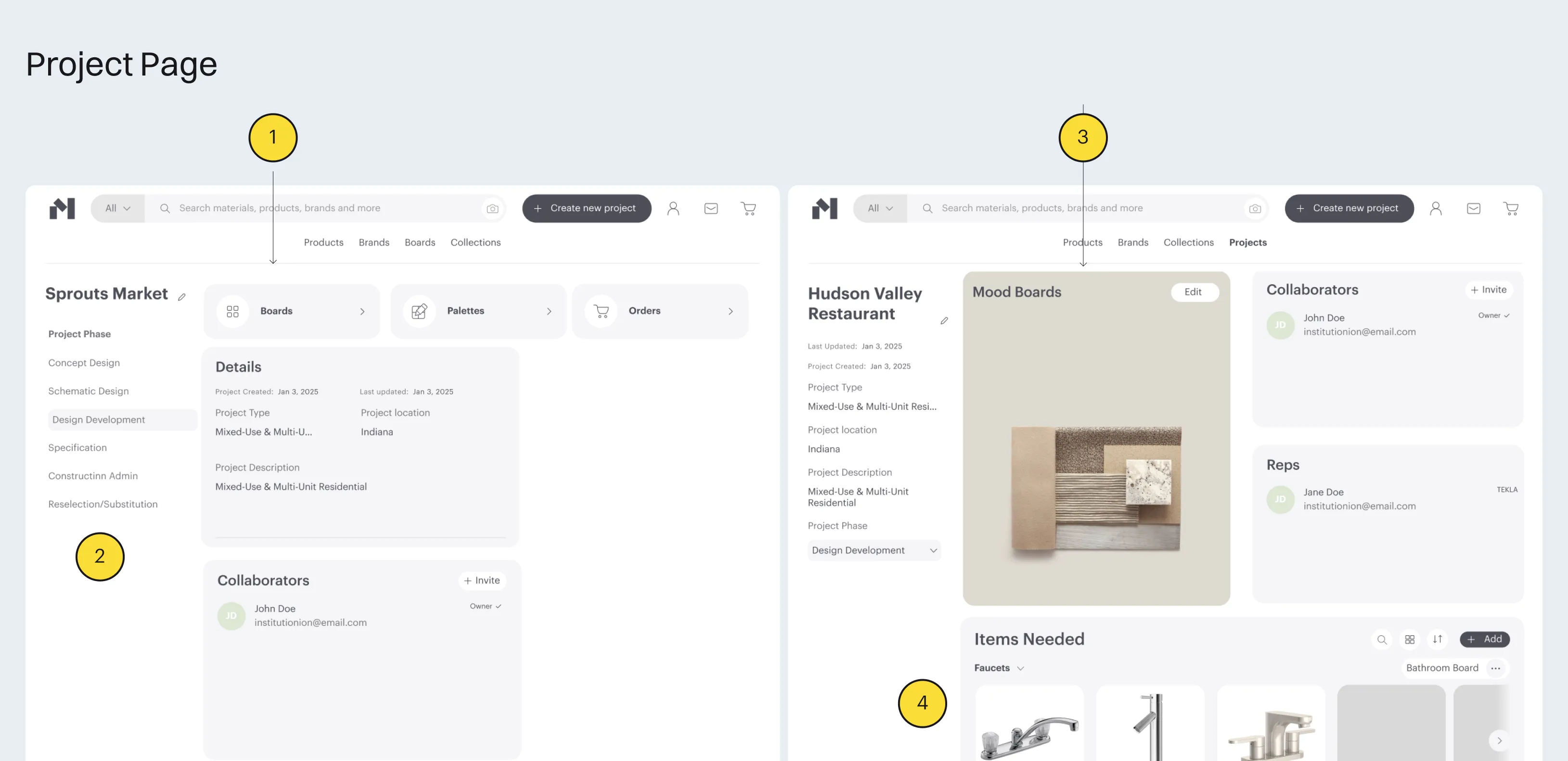
The project page lost its row of icon buttons and was replaced with a large, identifiable, intriguing image.
The project phase, an integral part to organizing priorities, deadlines, and lead times, for designers, was arranged as a highlighted state within a list. In it's previous form seems like it should affect the state of the entire page
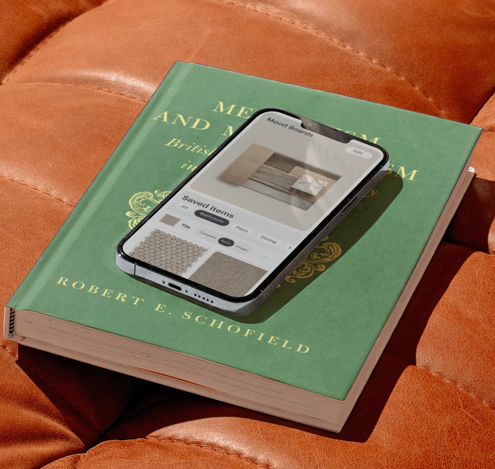
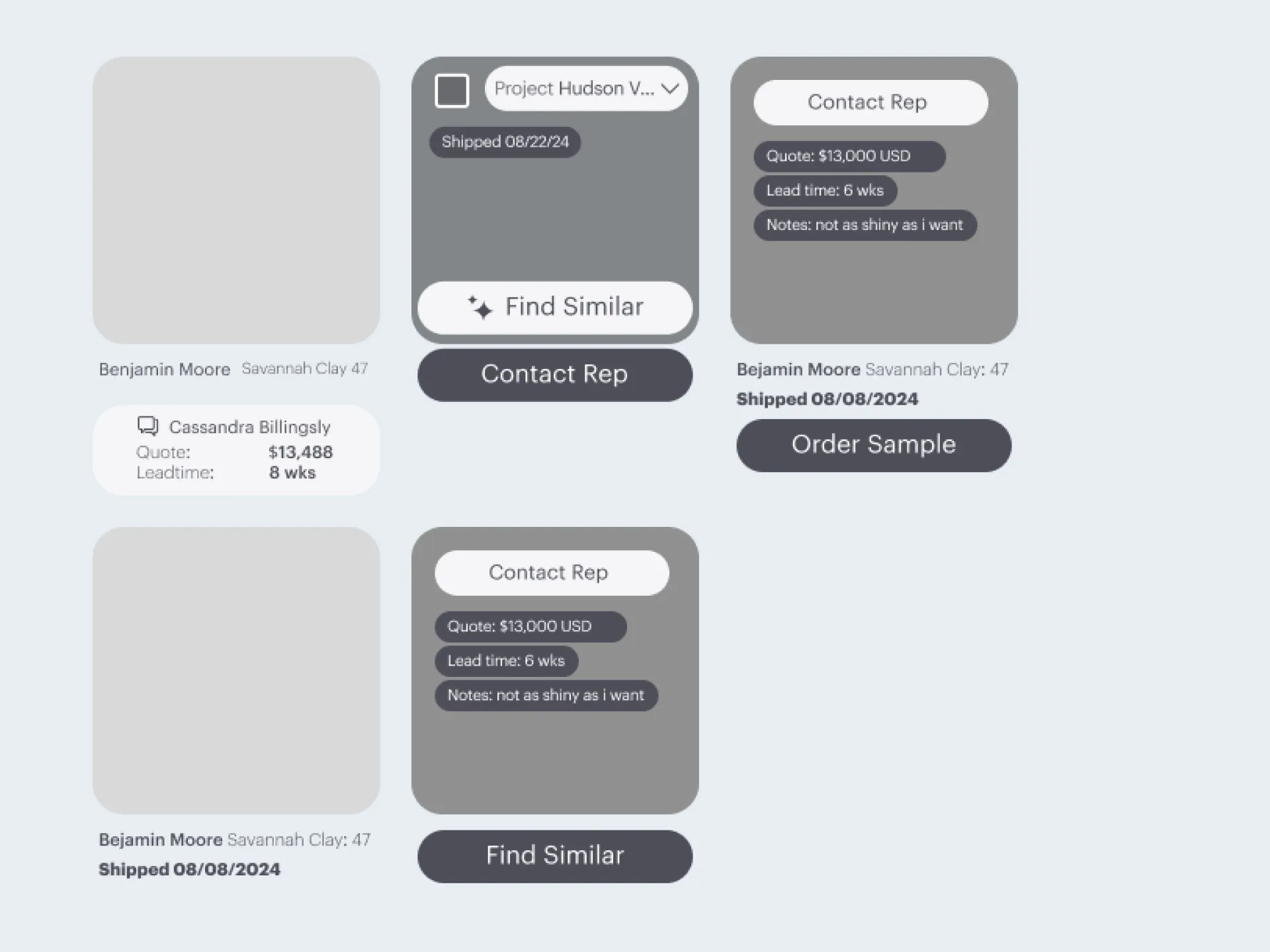
Mood boards, a highly requested existing feature, has been moved to front and center. Using the Mood Board as a project cover image turns it into a flexible tool that works with you over the course of the project.
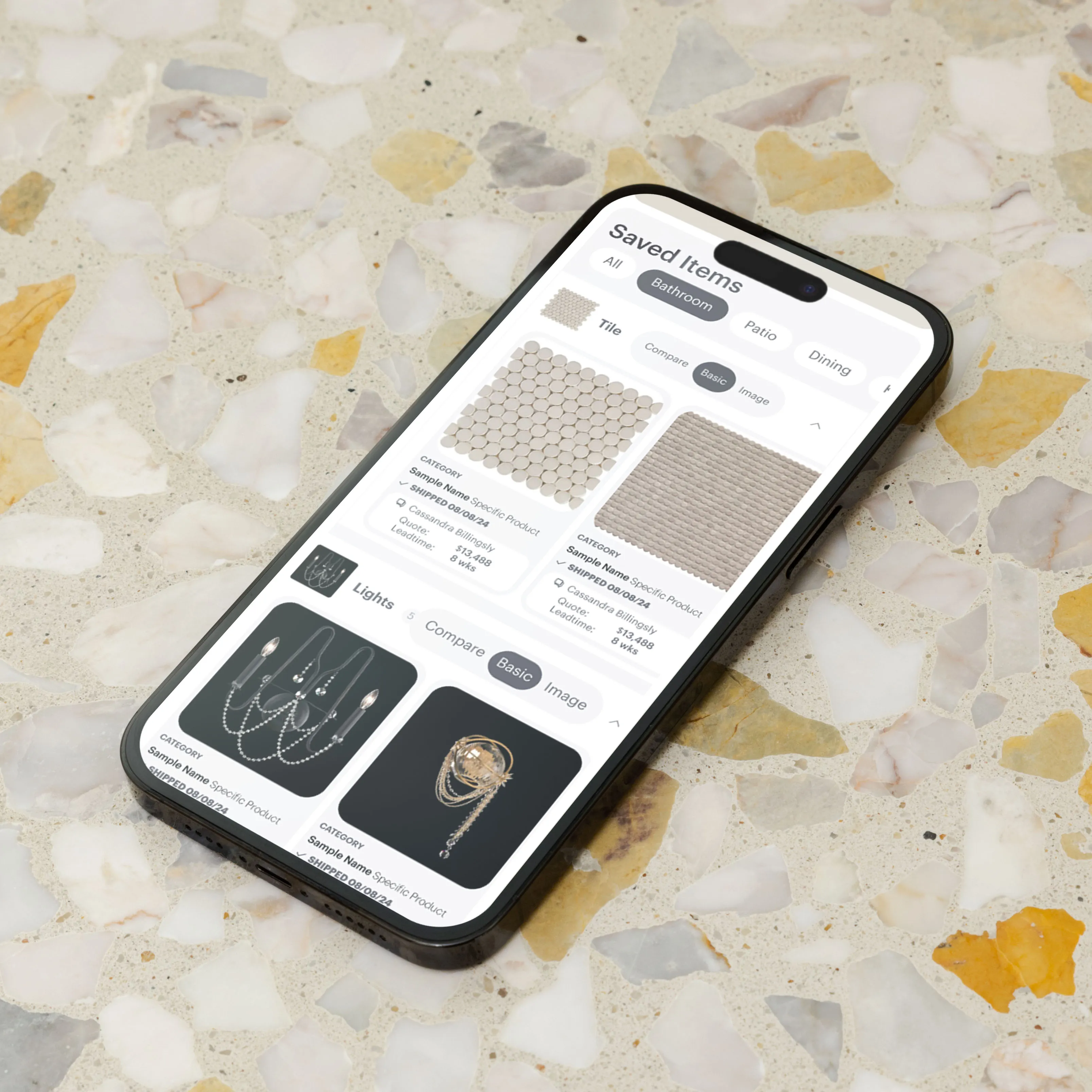
Items needed is the combination of boards organization. It provides quote information, as 83% designers said they wished was more readily available, if it was given by a representative.
This project created a central place for creatives to use the best tools available on the platform.
In one place, connecting materials, notes, and collaborators directly on the platform.
Before, this process was not intuitive. Providing a central flow that supports the connection between finding and using design elements is what this focused on.
There is so much utility in this platform from the individual tools to the wide catalogue of products.