Research
We wanted to explore positioning and services were supplemented by a survey and A/B testing to get more clarity on preferences without making people explain.
Surveys gave us two key groups
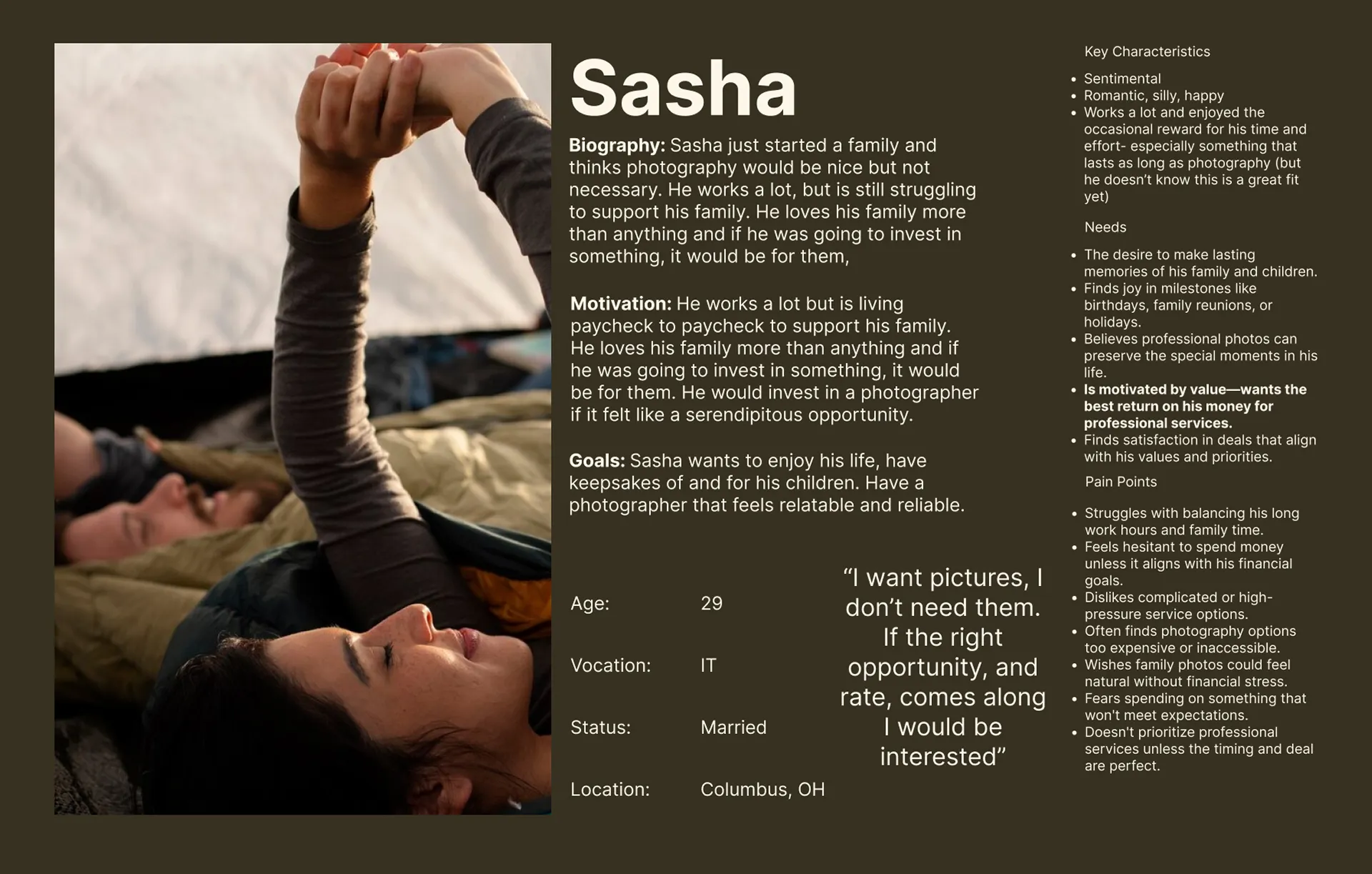
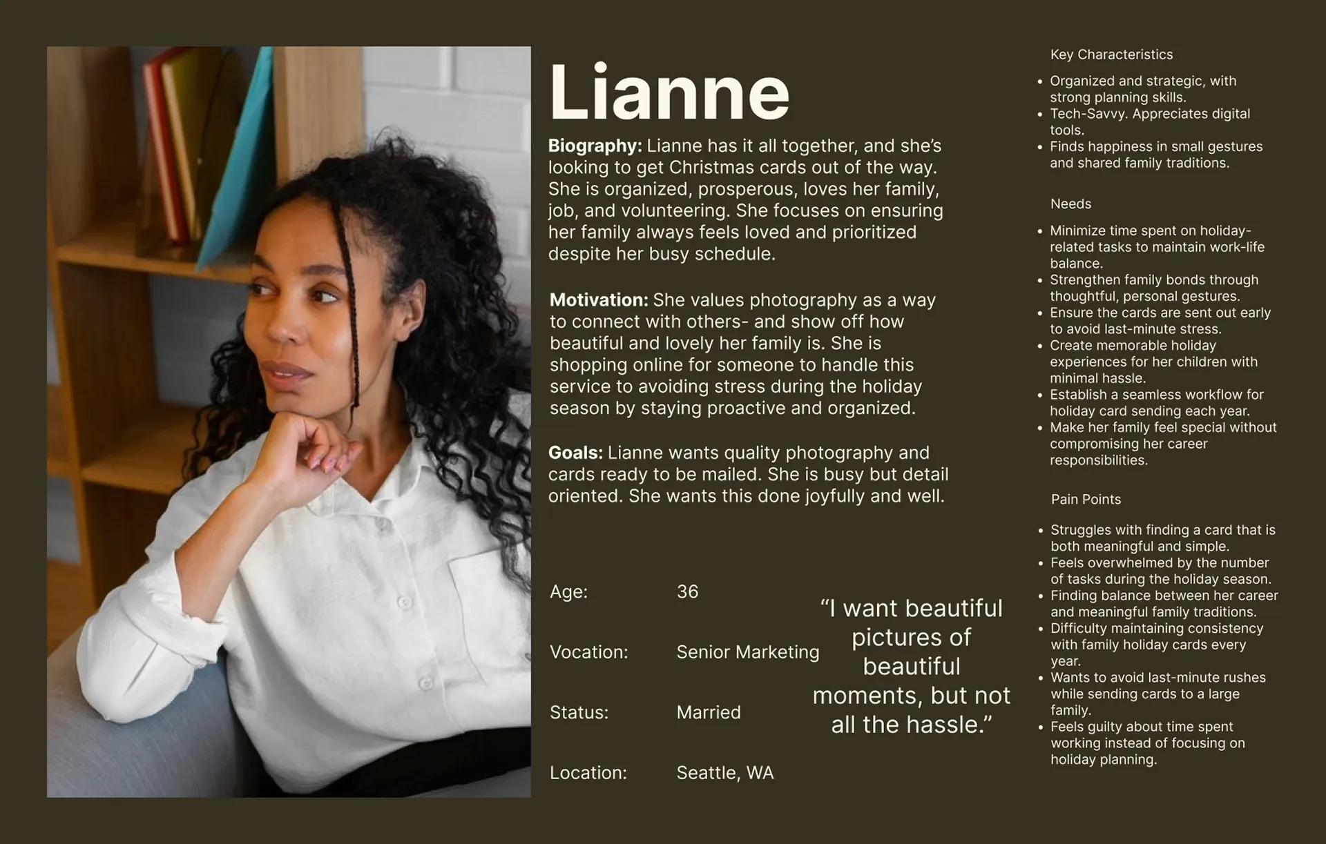
Some users, like Sasha, want professional photography but find it inaccessible; others, like Lianne, rely on photographers to meet business needs.
Both groups have shared emotional goals
Regardless of motivation, users want the process to feel smooth, exciting, and comfortable.
Opportunity for Human Centered Design
Balancing accessibility with professionalism creates space for a design approach that connects both sides through empathy and ease.
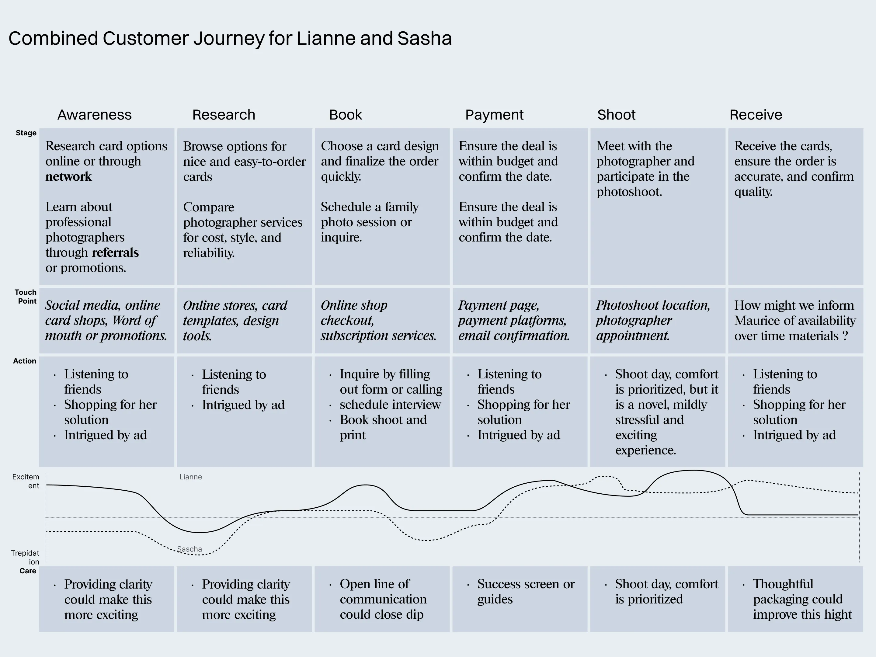
The solution needed to balance professionalism with accessibility—making the experience feel effortless for everyone involved.
A photographer without a network needs a good footing for whoever is in the area. Our two customers in her region are represented below as Sasha and Lianne.
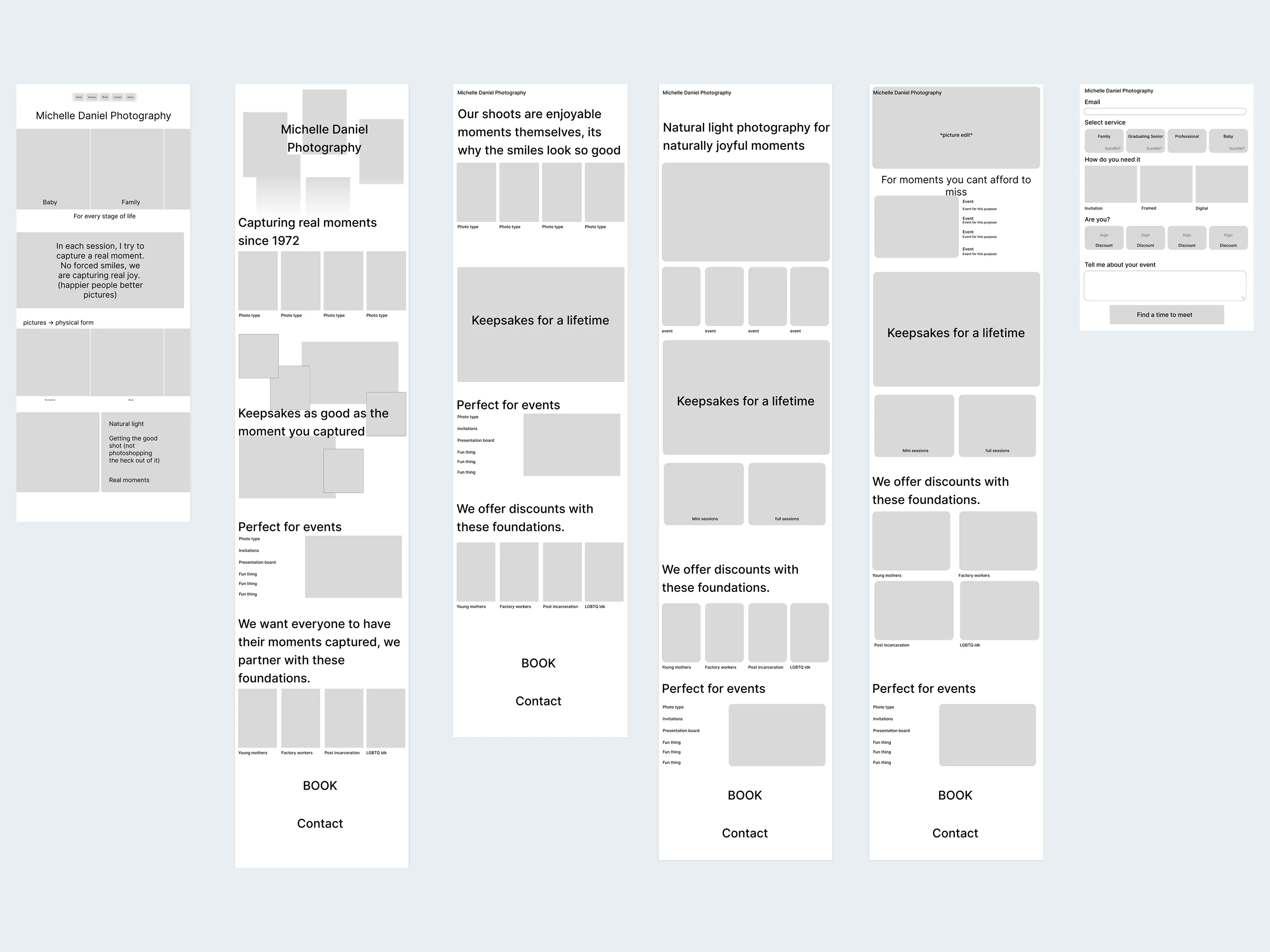
Roadmap to Wireframe
The content for the site came from user journeys and competitive audit.
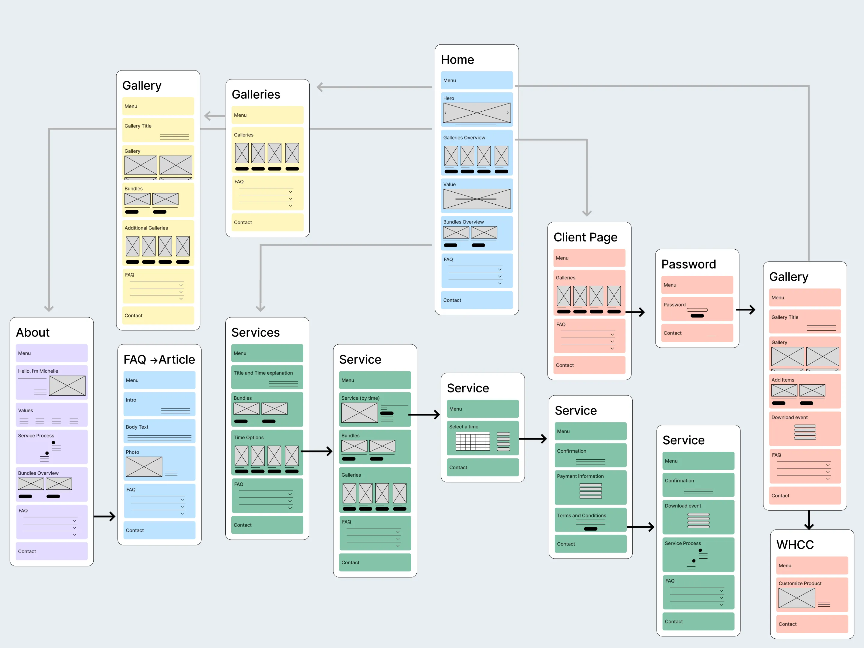
Wireframes reflected branding layouts and content structures beyond the sitemap.
Testing and High Fidelity
A/B testing validated assumptions and challenged biases, showing us what clients actually look for in a photographer and how they prefer information to be presented.
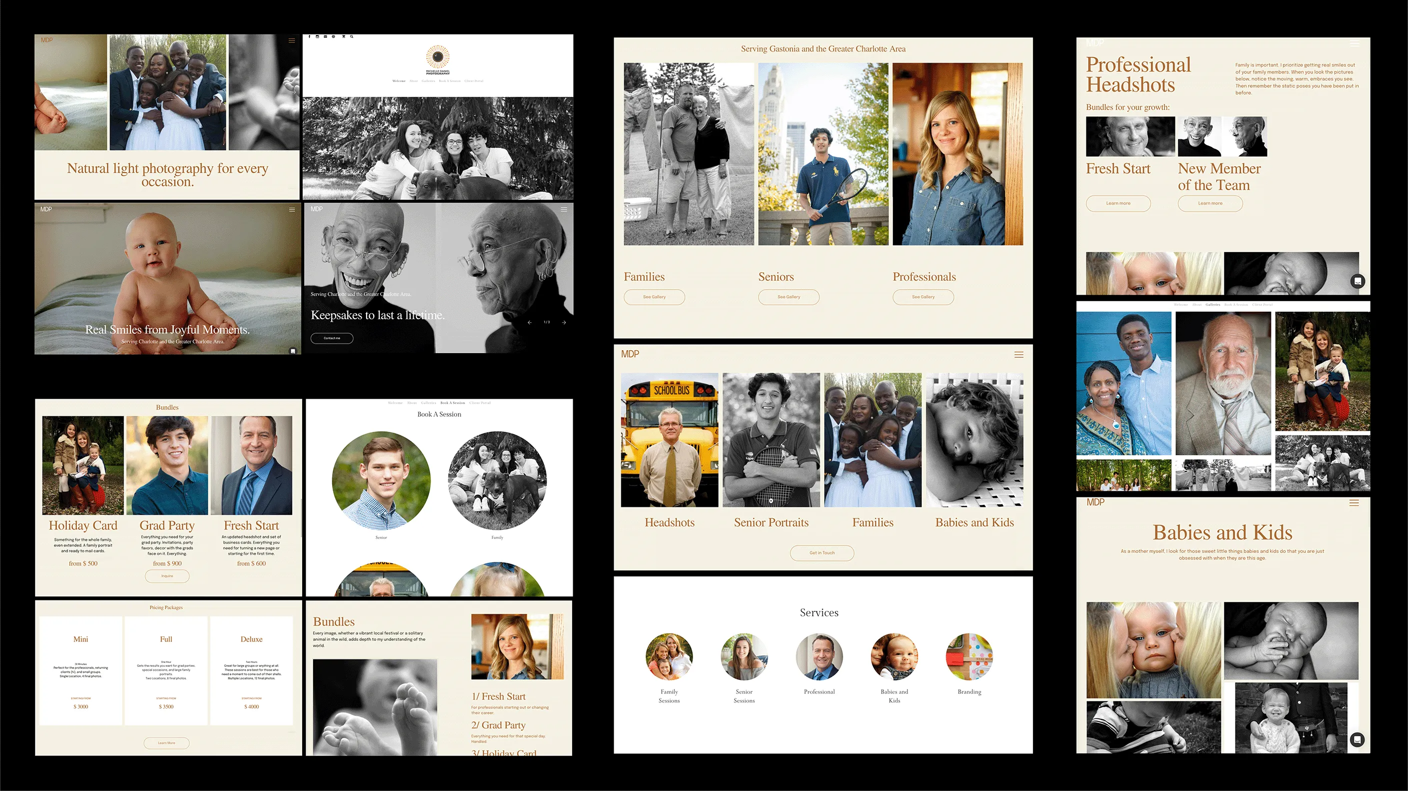
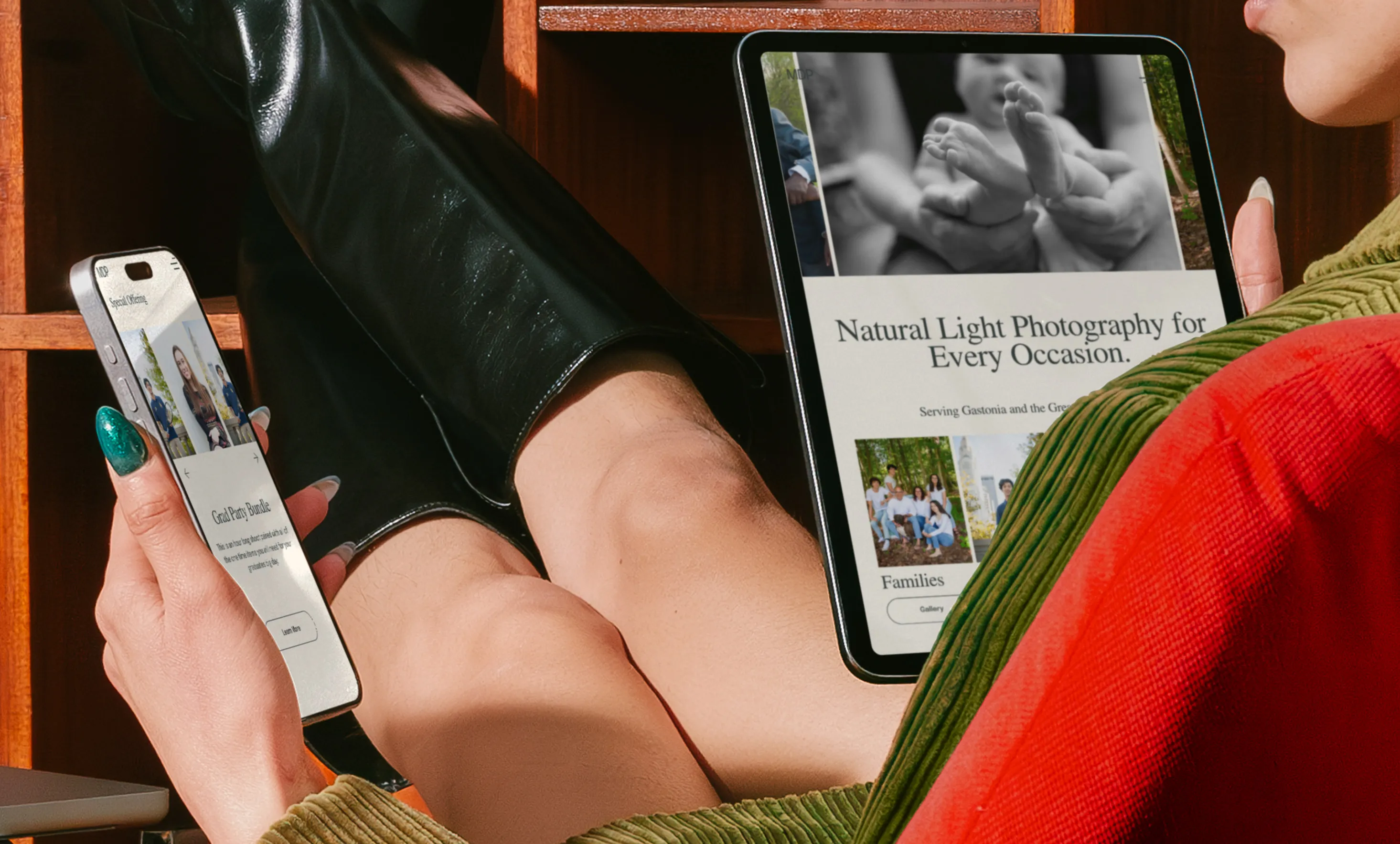
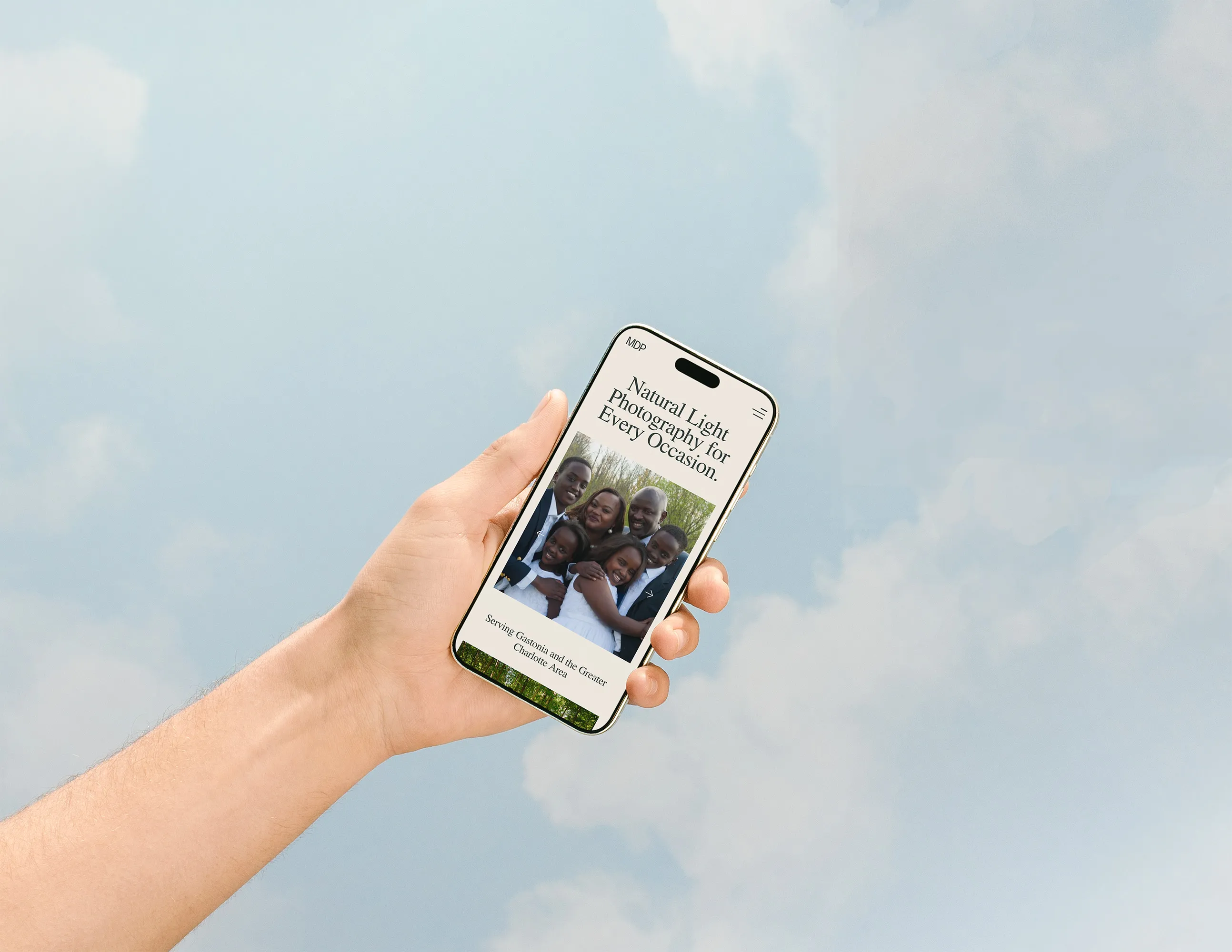
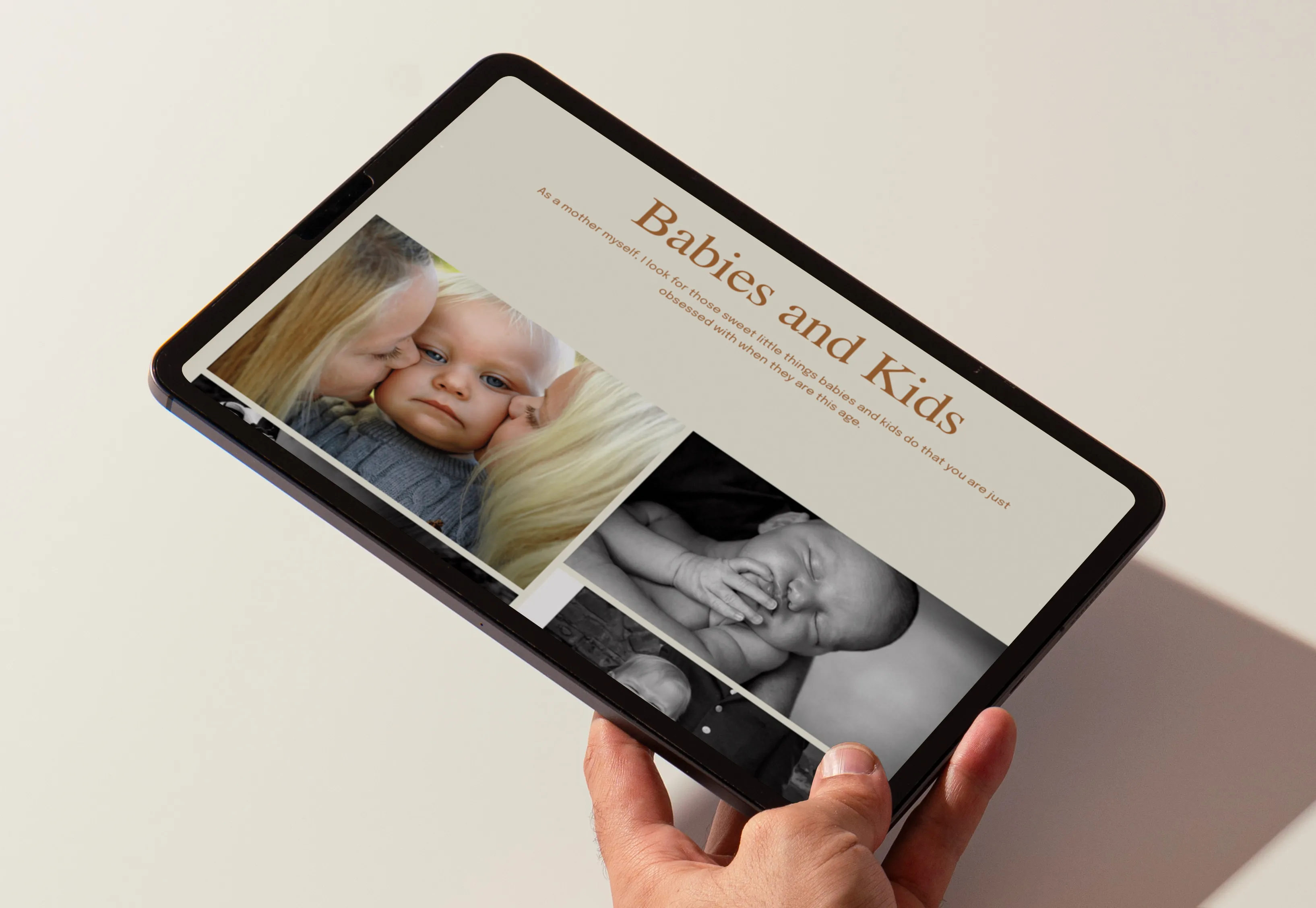
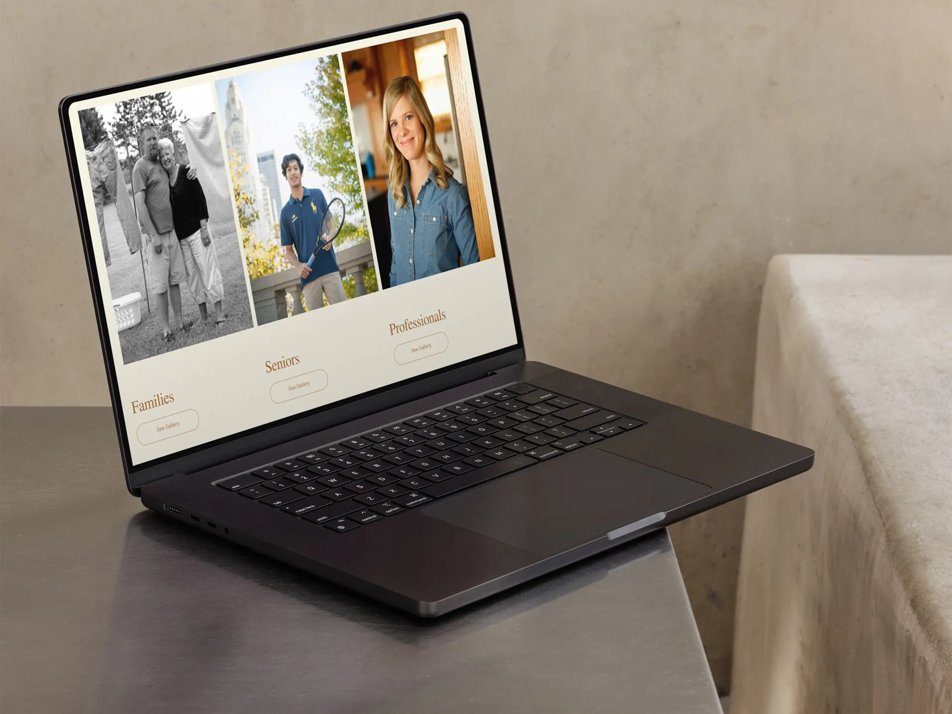
Participants consistently cited images (emotional portraits, diversity, natural looks, babies/children, black-and-white contrast) as the most influential factor. Layout mattered, but photos carried the most weight. This echos the quality of work mentions I would hear in the interviews.
Upfront pricing was appreciated and was noted to build trust. Users noted feeling represented in the photos (race, age, family structure) as a reason for preference. “I could relate to the family,” or “It shows diversity” came up often.
Designs that felt “slick,” “modern,” or “contemporary” were preferred, while layouts described as cluttered or dated reduced trust.
After learning was potential visitors liked we took time to make sure they had everything they needed with finely-tuned accessibility testing.
Accessibility testing
We looked at color blindness, content hierarchy for screen readers, and usability.
Impact
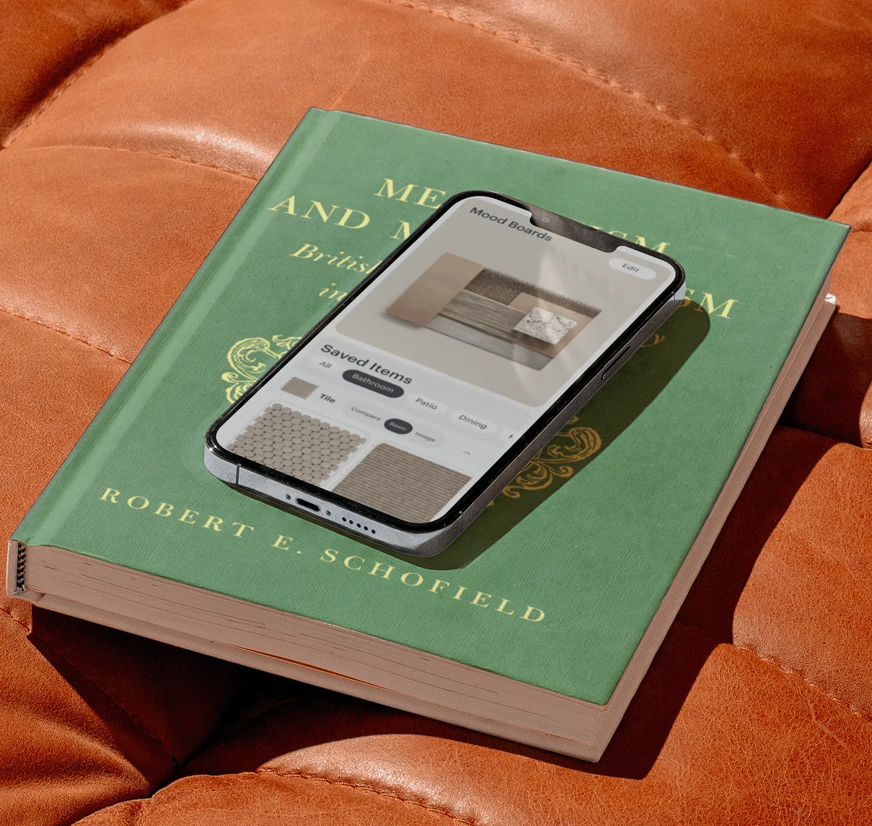
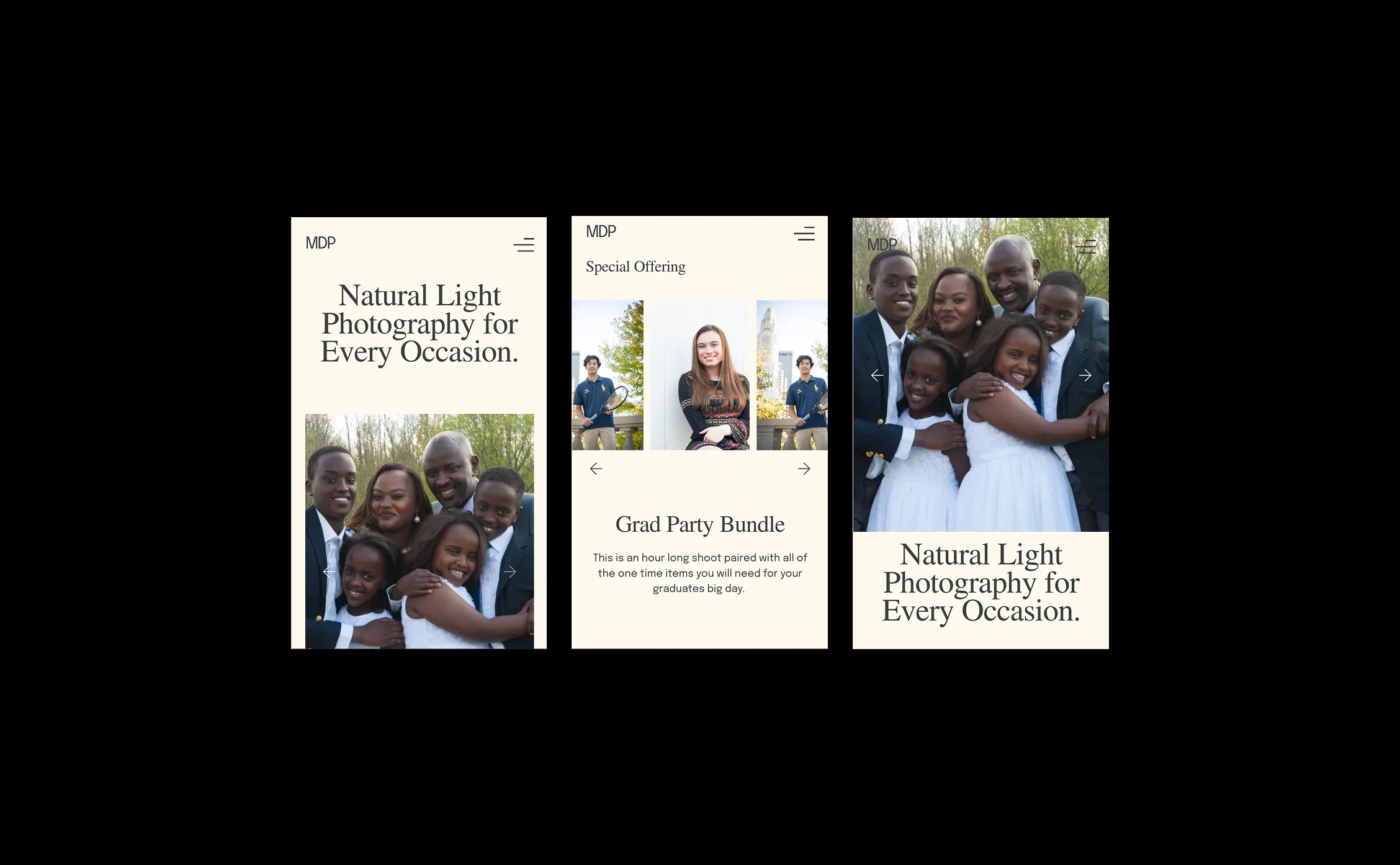
Instead of defaulting to industry-standard portfolio style, we implemented e-commerce principles so visitors can quickly browse, compare, and book services.
Guest clarity
It was important to make sure that people could understand what was happening.
Making the most out of the platform
The platform the site was built in, Pixiset, had limited control for layout and execution. Before delivering a design I would have made more effort to be familiar with the plat forms offering.