Kiki Lamb Flesh
Prototype

Early Blender Model
This lamb was created to be compatible with a system to deploy it as an AR filter.

Information Architecture
The structure and priorities of the site, this is where we first considered paths for visitors.

Early Home Page
This home page was comprised of a video of lambs as a background and cut outs of product images.

Sub-Page
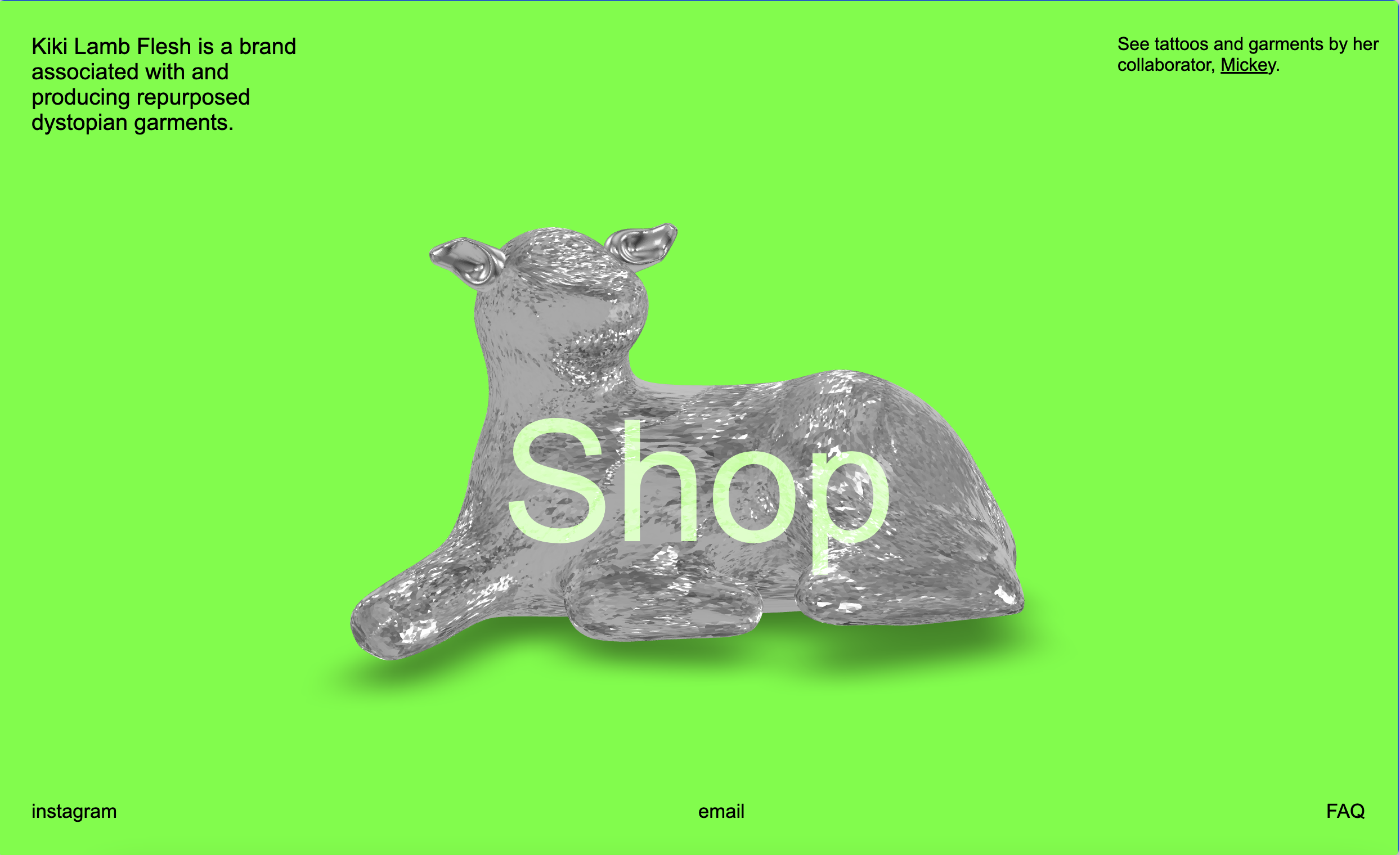
This page is for her collaborator, Mickey. They work together frequently and wanted to showcase together.

Existing Social Media Prescence
This is the best sample of her branding guidelines, the graphics she natrually gravitated towards creating.
Documentation
A full case study presentation is available here.


The final achievement of this site was adding a separate page for a collaborators work; Mickey. Minimized hosting needs, improve search engine optimization for both, and let them compliment each other.
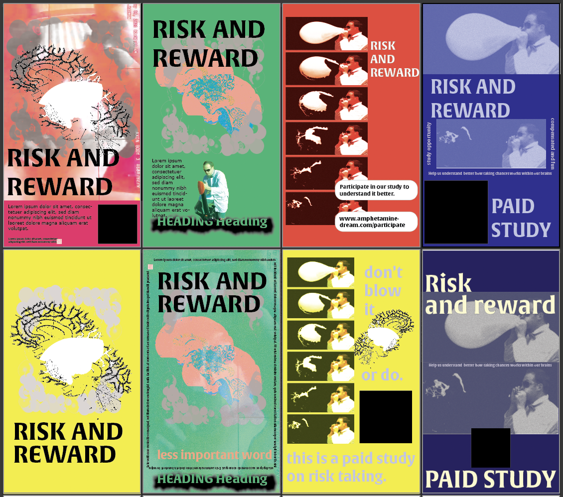
I also provided promotional posters and business cards for this client, as shown below.


Outcomes
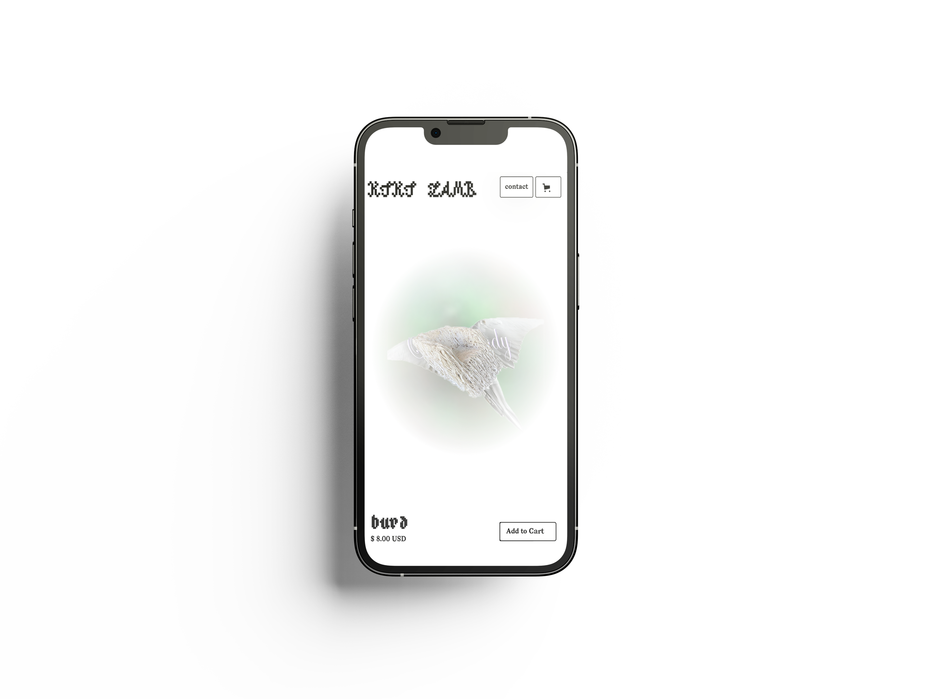
The online store needed to reflect the duality of her brand: a beautiful post-apocalyptic world told by garments. Taking her story of spending time with lambs on her grandfather's farm into a literal motif became the grounding line that we would push in to the loud. A vibrant splash page leads to a toned down eccommerce experience. Mixing thoughtful transitions, deep etched images of her products on a white background, and and centered text, also drive the duality of the brand she created.
Debby Friday case study
RabbitHole ↘︎

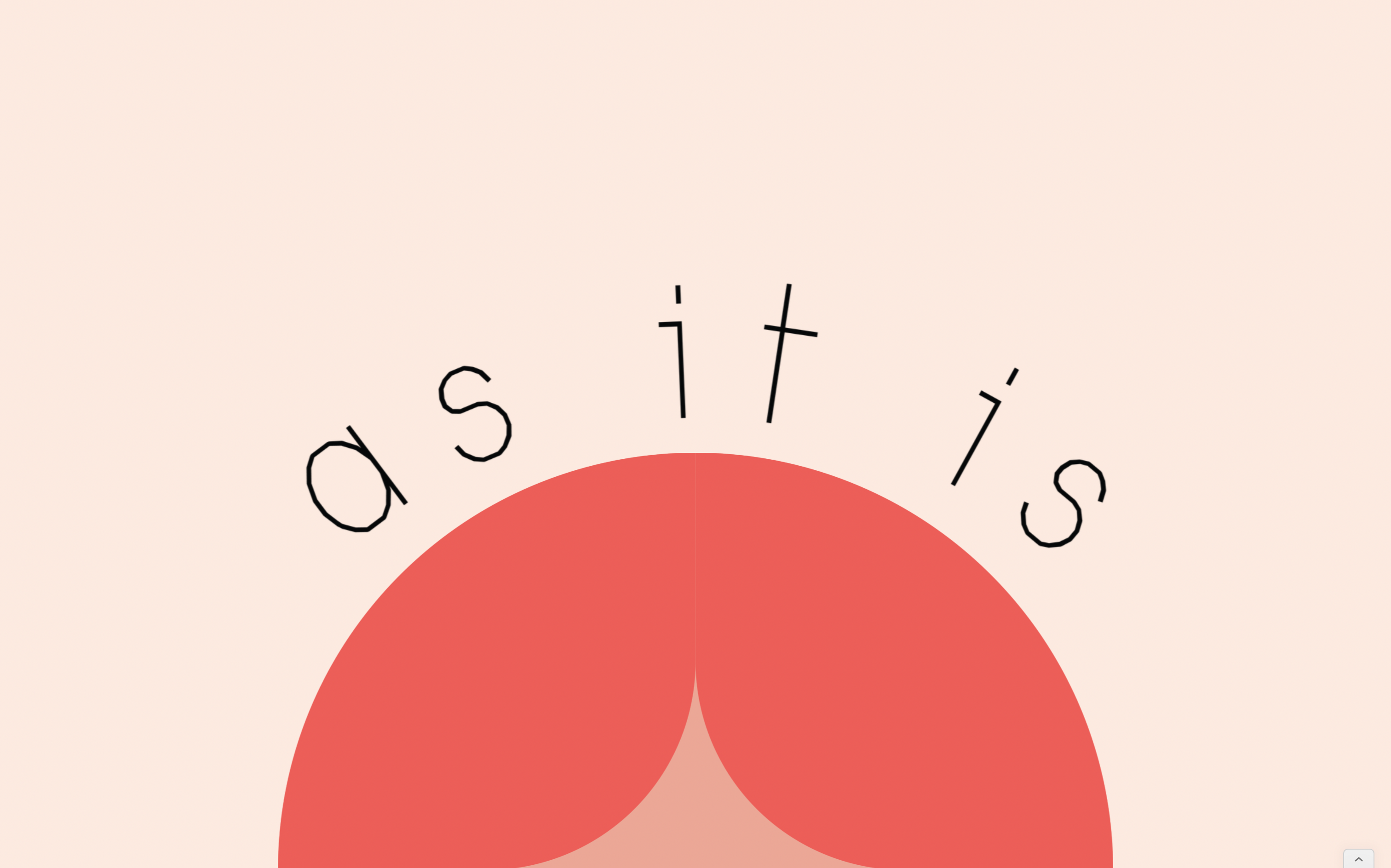
As It Is ↘︎
Kiki Lamb case study
Goober ↘︎
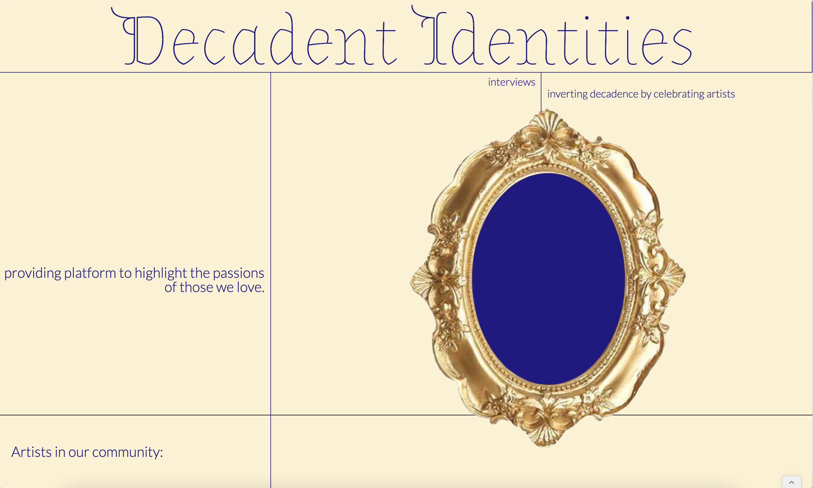
Decadent Identities ↘︎
After Hours ↘︎
ADHD Study coming soon