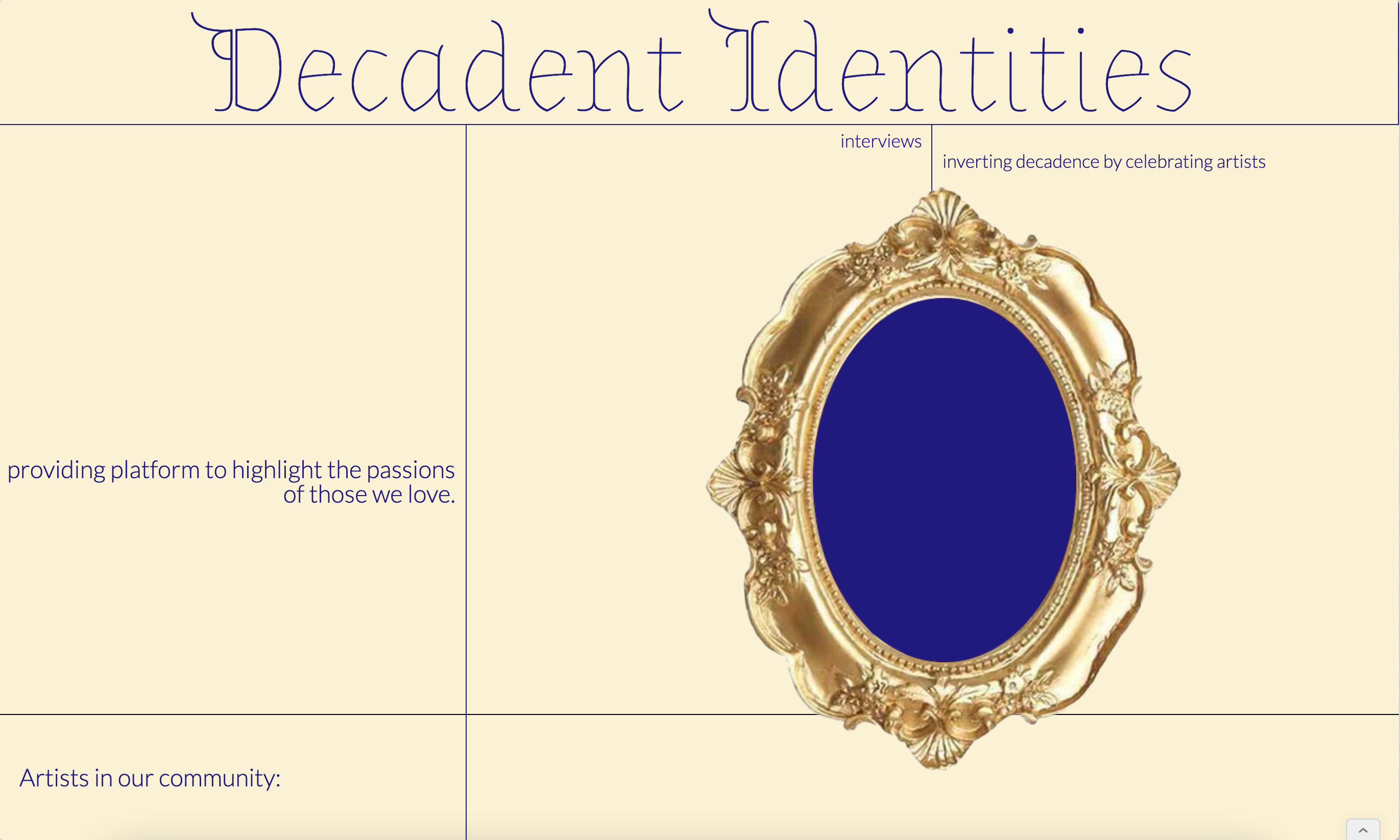
Gallery App
Background
This simple application was meant to provide an introductory experience to our gallery. This study was meant to measure the success of proving archival relevancy, establishing rapport, and ease of booking.Research and Considerations
The initial interviews regarding an educating gallery experiences ranged from disinterested to excited. I infered this speaks to existing perception of galleries.
These studies were conducted before and after prototypes in the format of guided and remote surveys.
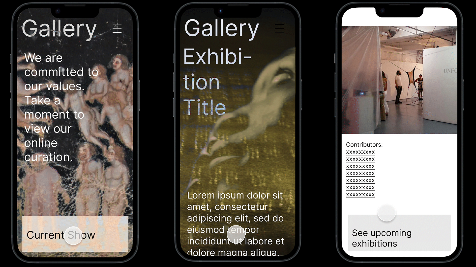
In regard to our first prototype: 3 out of 5 people stated they wished there was more information available on the artist featured. 4 out of 5 missed a gallery introduction, something like an about page. Only immediately relevant information is available on the app as is.
In regard to the archive function: 2 out of 5 found the archive to be interesting and relevant as is. 2 out of 5 stated that it did not add to the experience. The archive was displayed as a title and image.
In regard to sceduling hospitality: 3 out of 5 enjoyed the option to declare a reason.2 out of 5 felt the reasons were too specific. Buttons depicting the “reasons” dominate this page and dictate the booking experience
Full Report
Prototype

Early Wireframe
An hand drafted version of general placement of items on pages.

Information Architecture
A diagram of general flow and structure.

Competitive Audit
This was an indepth study (full version in the PDF above) of similar products to grasp where we stood.
Documentation


Outcomes
The simple app for a gallery prototype exposed accessibility issues in booking and narrowed the potential physical accessibility short fallings of the spaces.